22 January 2020
JetReStyle, or the story of how we changed our logo
A few years ago we told how we came up with the company's name, and how our logo was born.
And today we are going to tell you how we changed the logo)
Why did we do this? Well, because the previous version of the logo was born in 2004, but by 2019 it was completely out of date: it was obvious that the shape of the flame was from the previous decade, and the graphics – they don't do it like this at all now. You could tell that the logo is old. Therefore, we began to think with all the art directors, including our CEO Alexey Kulakov, how we could update it.
Well, not to think – to draw (we are designers, after all!)
This is what our old logos looked like:
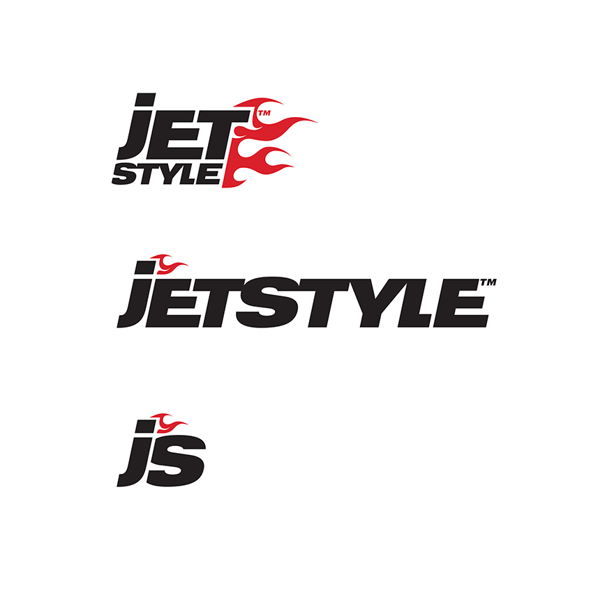
And here is some of what was in the process (with comments from Alexey).
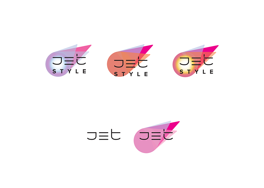
Playing with the Asian style
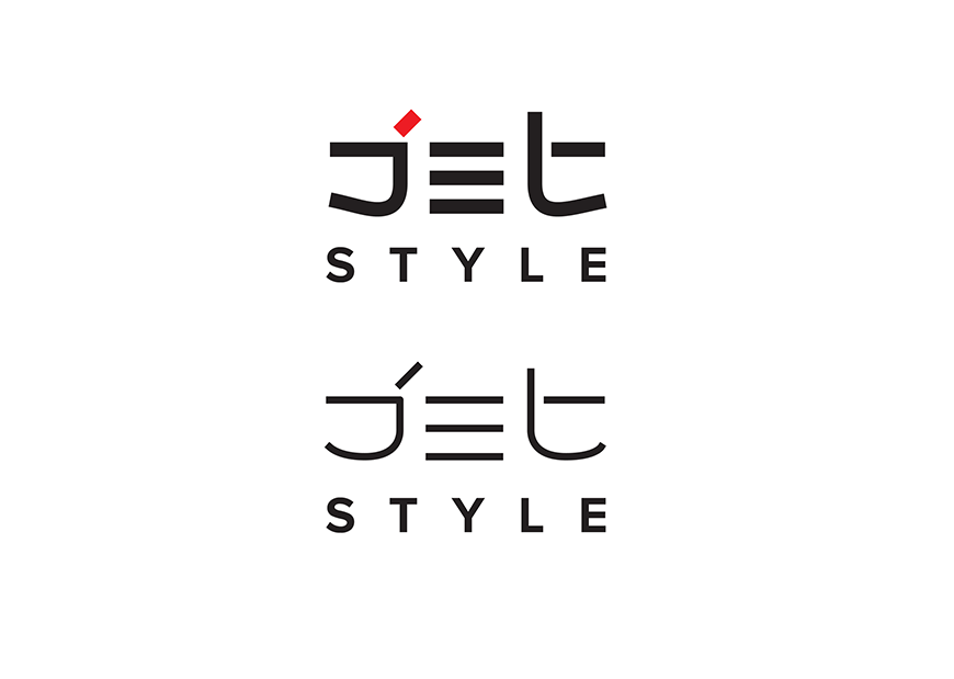
“Jet turned out to be very cool, but it's not very clear what it has to do with us) And we lost flame”
We found the fire, but no, this fire doesn't look like us!
Light logo styles
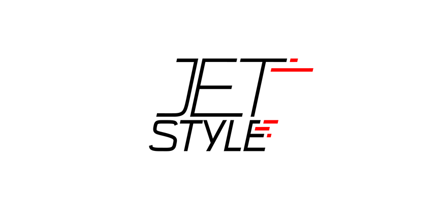
“What if we make everything lighter?”
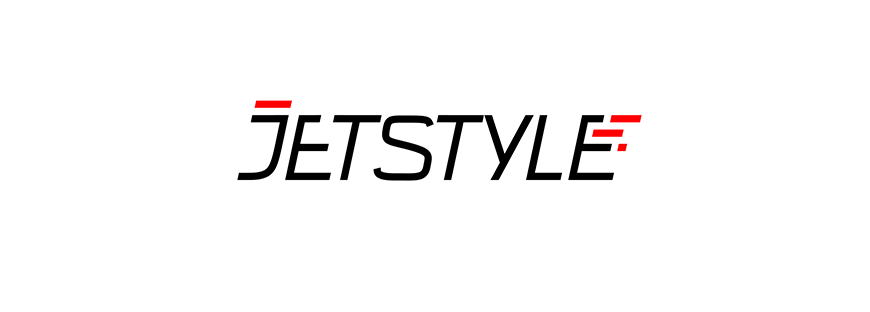
“No, it seems that those who haven't seen our fire before won't notice it now”

“Well, S doesn't look right”
In search for the perfect flame
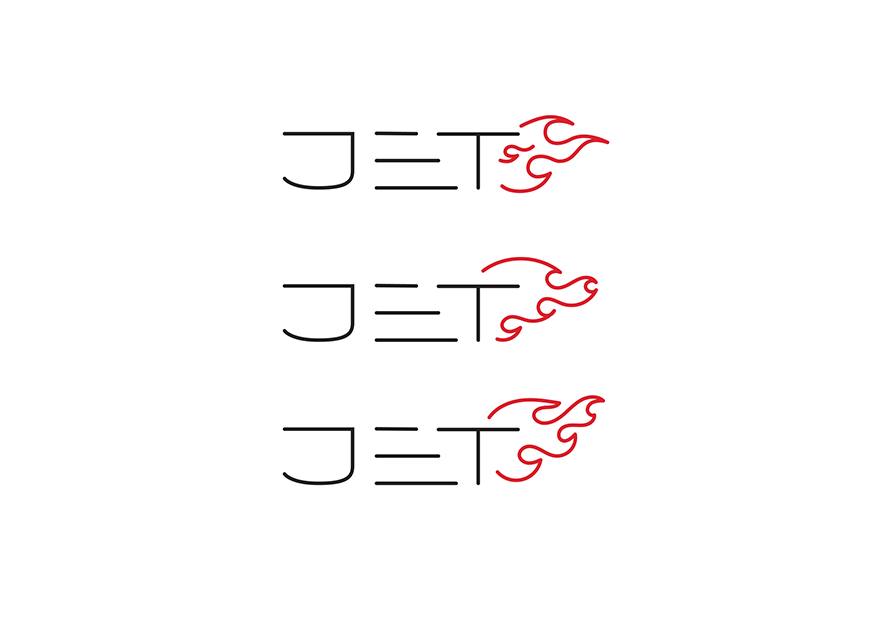
"This shape of the flame is still from the 90s"
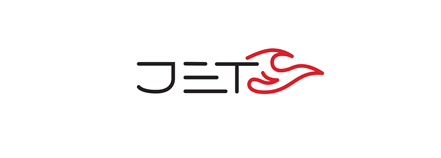
"And this one, too"
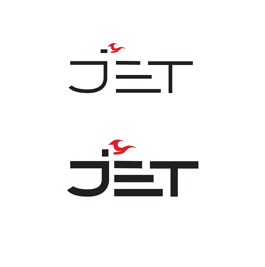
“No, the old flame doesn’t fit into the new logo at all”
Looking for a direct style
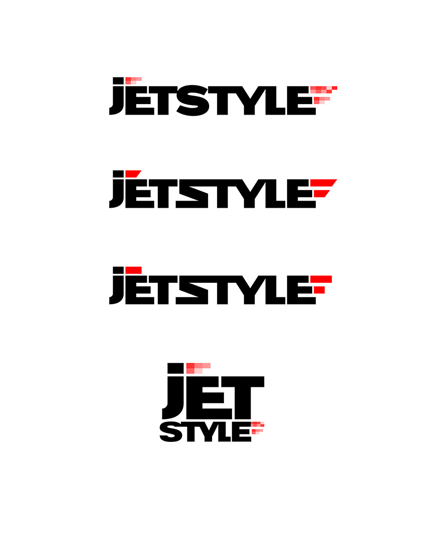
“Well, not exactly...”
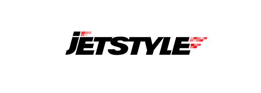
“By the way, the idea of a pixel flame is good (remember this), but in this form, it seems more like this fire has been censored”
Going back to oblique style, simplification
Back to the basics. Again.
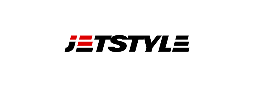
“This is pretty nice, but the fire isn't readable”
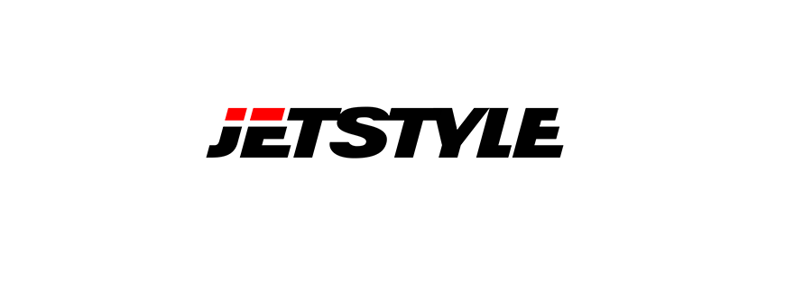
"And this"
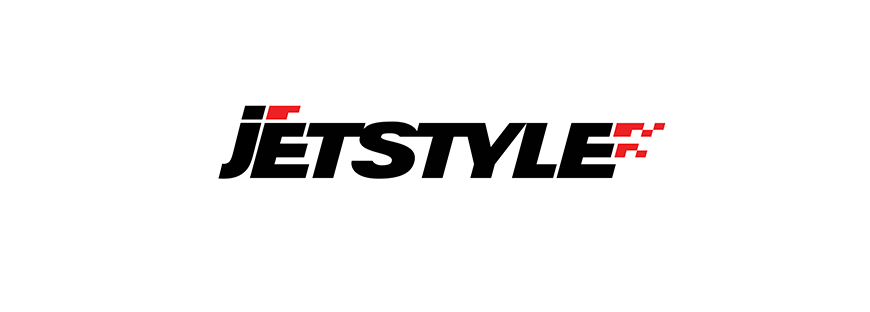
“This red is not bad”
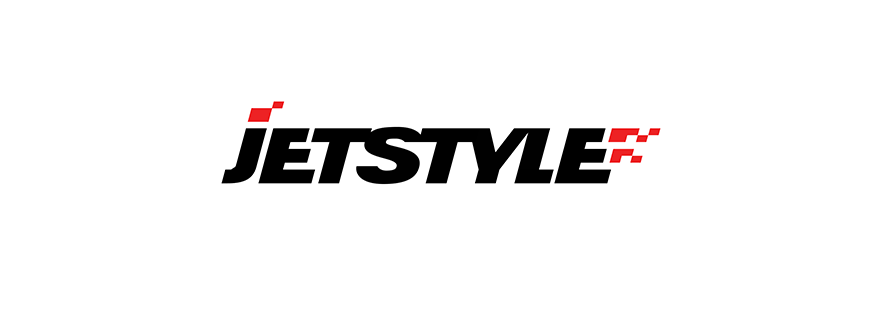
“And this one looks like a Christmas hat”
“The flame is good here, but we must continue the search – it is too fractional at the moment”
In search for the short logo
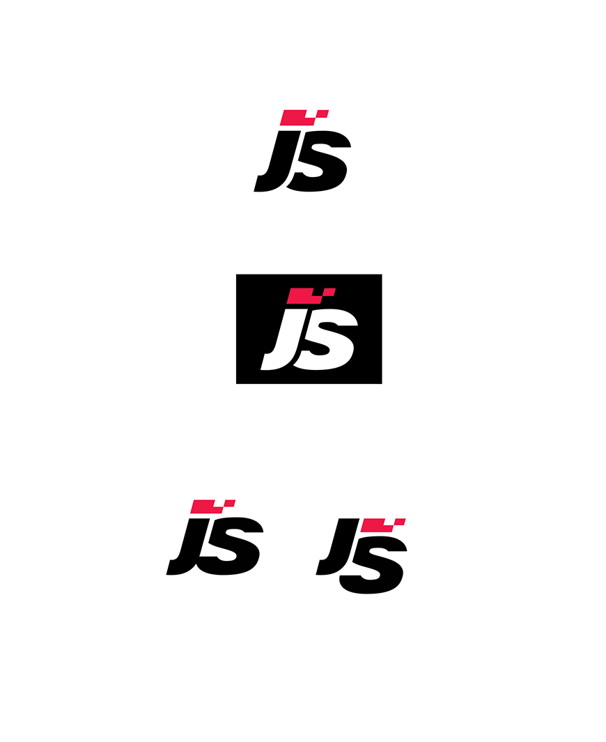
“These are some of the options we had”

“But we chose this one”
Preliminary version
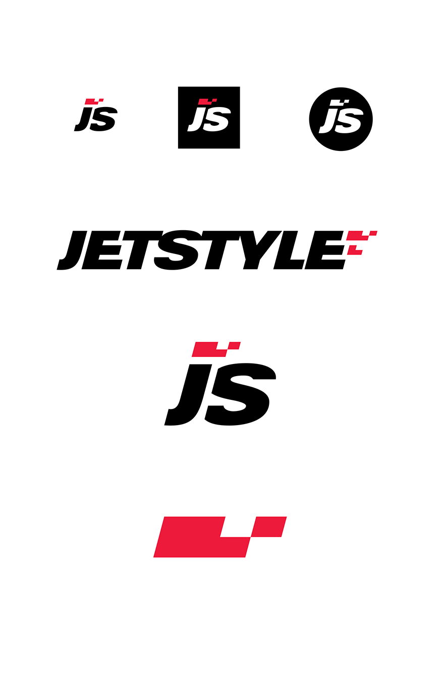
"Summed up the interim results"
But we still need a stacked (double) logo!
Search for a stacked logo
It seems that this was the most difficult task: first you notice a Swiss flag inside the flame, then something else is wrong.
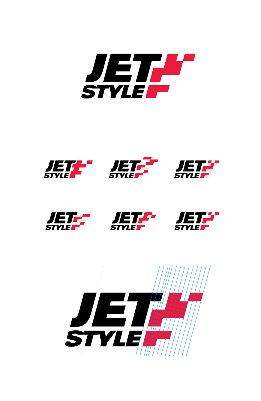
But we did it!
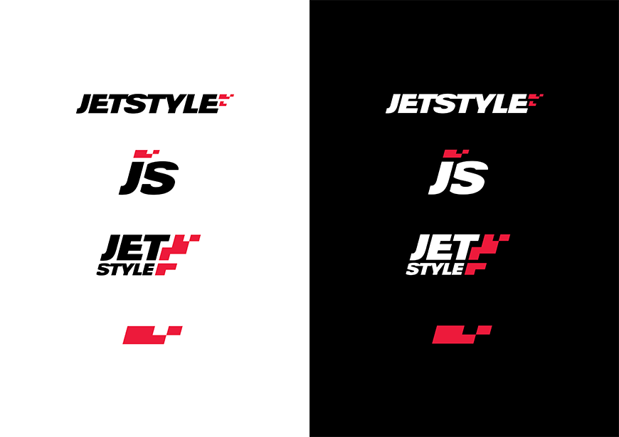
JetStyle Logo – Before/After:
You might also like
