13 April 2018
The world and the interface in the perception of blind people
Read our interview with Mikhail Voitsekhovsky, vice president and co-founder of the "White Cane” social movement, on how visually impaired and blind people use computers and smartphones and how they live in Russian and digital reality.
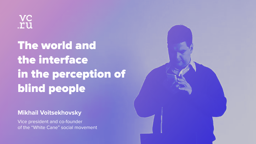
Mikhail is now 41 years old. He was losing his sight gradually from the second grade and got completely blind in 15.
At a meeting with the JetStyle team, he told us how designers and developers can make the life of blind and visually impaired people easier and more comfortable.
About blind and visually impaired people
It is believed that there aren’t many blind people in the world. But blindness is not a clear definition.
There are those who can’t distinguish day from night, and there are those who can’t see the number of the bus. There is also such a thing as inattentional blindness, for instance, when you get distracted: it’s like you can see everything, but you don’t notice things. And there is a temporary blindness when you enter a dark room from sunlight and vice versa.
According to the World Health Organisation, 10% of the world's population has a visual impairment. But they are different kinds – from colour vision deficiency to complete blindness. For example, there are one thousand of completely blind people in the Sverdlovsk region. And there are seven thousand in the Society for the Blind, which also includes visually impaired people.
When you develop interfaces, you need to put yourself in the user's shoes. This is useful even just for overall development.
Our problems in society are not connected with the material environment
Even in the process of losing vision as a child, I was thinking that it would be possible to rely on technology in the future and that there will be devices that would brew my tea or go shopping for me. When the Internet appeared, we were hoping for some artificial eyes and echolocation.
But at some point, I realised that a person's problems are not related to the material environment, but to the society. First of all, this is a matter of accepting the changes that have happened to us and adapting to them. You need to be able to formulate where you are and be able to ask people for what you need. You need to learn how to explain this.
The stage of visual impairment is more dangerous than complete blindness
People don’t understand that you are visually impaired, and you yourself don’t fully realise how bad your eyesight is. You make rash actions: you run across the road without seeing the colour of the traffic light, and you do other things which are not safe.
And the sooner you accept all this internally, the better it is for you and for the others. When people realise that you can’t see, they respond more adequately. For example, drivers quietly wait until you cross the road, instead of signalling, waving and yelling at you.
It is necessary to teach blind people to live in this environment rather than isolating them from it
I went to school for the blind in Verkhnyaya Pyshma, one of the best schools for the blind in the USSR. I was lucky, there was a very powerful and professional team of teachers with many years experience of teaching blind children. But the problem of all specialised institutions is that the children there are isolated from society and that society is isolated from them.
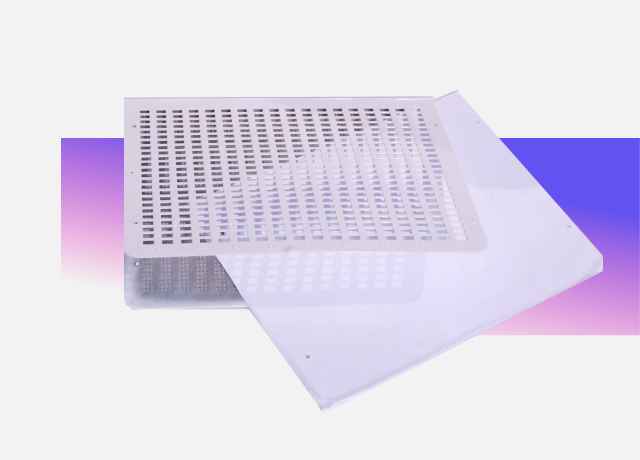
Braille writing device
With all the power of that school, it had a problem – there was no rehabilitation in the open space. The school is responsible for safety, and walking with blind children on the roads is, at least, dangerous.
One of these schools even removed the ice rink: they thought it would be better to clean everything up and lay the surface with soft mattresses. But it seems to me that this strategy is wrong because if we want to ensure a person's security, we must teach them to live in this environment, and not isolate them from it behind the walls of special institutions.
About devices and programs
Since the 1990s, nothing has changed in the interface for blind people.
I was one of the first ones in the Sverdlovsk region to have a computer. It was 386SX at 16 MHz. Even then there was a program that read through synthesiser what was in the video memory. There were even attempts to make not verbal but Morse code output, since the synthesis of speech was a difficult task for the computing resources of that time. Nevertheless, starting from the very first computer systems, there were attempts to adapt them to blind people’s needs.
Braille line – expensive and not always convenient
At the same time, the Braille line appeared. If the blind use the Braille system, then why do they need a monitor? It is better to make a special device for input and output of information. It's like for the elderly: it's hard for them to learn new technologies, so let's give them a special reduced device.
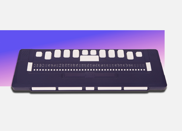
Tactile Braille display, also known as Braille display or Braille line
There are areas where the Braille line is indispensable – when the user is not only blind but also has a hearing impairment. Or when it is necessary to release the user's auditory canal for other tasks, for example, when working in a call centre etc.
The Braille line is also useful when working with information in which every character is important – like maths. But in other cases it is not very convenient, requires knowledge of Braille and is more expensive than an average computer.

Braille Mobile Organiser
There are now Braille mobile organisers that you can use instead of a smartphone. But they cost around six thousand euros, quickly become outdated and poorly supported by the IT community.
My phone is a regular Xiaomi Mi5 with a global firmware. No special adaptation, just a TalkBack turned on in the settings.
I get up in the morning, turn on a computer, read mail, browse through Facebook, news. There is a usual software on my PC: Windows 8.1, Mozilla Firefox browser.
Most blind people use a screen reader
NVDA (Non-Visual Desktop Access) allows me to work with Windows. This is an open program, made by two Australians. It’s free for users – the program exists on donations and, at the same time, it is more successful than many commercial ones.
Another leader is Freedom Scientific. Its developers are also blind, but due to its cumbersome nature, this program is difficult to set up. And it costs a lot – around $ 700.
There is also Windows Eyes. This program has now focused on the elderly. This environment has limited functions, although, it is easier for an unprepared person.
Today the general tendency is to build in the possibility of non-visual access into the operating system. You buy a device, go into the settings, turn on the screen reader – and it starts speaking. This function is already available in both MacOS and Windows.
A screen reader built into the phone supports messengers
For example, it reproduces almost everything in WhatsApp. But does not read the statuses: it's unclear whether the message was read or not (it has changed, while we were preparing the article. Now the statuses can be read too – JetStyle).
A Telegram reads the message, but not the list of users. So, it’s almost impossible to use it. Although, I have not tested the Telegram web interface on the phone yet.
On a PC, I often use Miranda IM because of its multi-protocol. I have Skype, WhatsApp and all the other messengers on it. This is convenient: you don’t need to learn additional hotkeys. But there is no plug-in for Telegram on Miranda IM.
Synthesised speech does not impose emotions
We must understand that we perceive the meaning through the brain. When you listen to an audiobook, read by an actor, he translates you his emotions. That’s why I prefer synthesised speech – it gives you more freedom. And I usually increase the speed of speech reproduction twice.
“Smiling face with heart eyes”
Lately, Facebook does quite well at voicing emojis. I think the reason for that is not just the blind, but the development of artificial intelligence in general. If you send an emoji, the program reads it as, for example: “A smiling face with heart eyes”. Although, I don’t really like these kinds of emojis, for me simple brackets are enough to communicate my emotions.
Touch keypad beats voice dialling
I type blindly even on a smartphone. Of course, the keyboard on the touchscreen is not the most convenient thing – basically, you have to touch type each letter, like on a computer. There were attempts to use other keyboards, but everyone has got used to the Qwerty layout. So, we just carry on poking the touchscreen.
The voice dialling has another issue. You dictate the text, but the program only types what it hears. And it’s very hard to edit this text afterwards, at least, on Android. The main problem in setting the focus is that you have to move the cursor character by character. If anyone invents a convenient voice dialling for editing texts – it will be a breakthrough.
In addition, voice dialling has a problem with recognition. At the moment, it can only be used if the accuracy of the statement is not critical. For example, if you need to find something on Google Maps.
If each comma is important, it’s better to type manually
An iPhone has less false triggering on the keyboard. And Android makes some strange mistakes - it might voice one letter, and write another.
Of course, the speed of dialling on such a keyboard is low. Developers tried to make several versions of the Android-keyboard for the blind, but, so far, they haven’t achieved much. Even if it exists, with each update of this keyboard you will also have to change your Android.
But if someone will come up with an Android keyboard for the blind, they deserve a big respect.
There were also attempts in making gesture keyboards, but they did not get very popular. Some gestures, for example, swiping, are intercepted by the accessibility program – it has a higher priority.
About interfaces for blind people and for everyone
A modern trend is to make a common interface
Today it is important to make such interfaces that could be used by blind people, by visually impaired, by people with hearing deficiency and with movement disorders – by everyone. The benefit of such a solution is that all the content does not need to be adapted after it’s been created. It fits into the availability shell – and you don’t have to manually support ten different interfaces.
The only thing that is required from the developer, is to start creating the interface right in the environment that supports the necessary functionality from version to version.
Versions for the blind are useless
We are used to the fact that there are two main approaches: to make two versions (the regular one and the one for visually impaired people) or to make a version that both audiences can use. To keep both versions up to date is expensive.
There are several standards in the world that describe the criteria for accessibility. They allow interface developers to make one version for everyone.
I don’t use versions for visually impaired people at all.
Mobile versions have less unnecessary stuff
The essence of non-visual perception is that when you read a website blindly, you read it consistently.
When you see the website, there are some flashing elements and bright buttons that catch your eye. As a blind person, I use hot buttons to quickly navigate through links and headers, but nevertheless, I go through the page consistently. And it isn’t very convenient if the site has a lot of information that does not apply to your interest. Mobile versions have less unnecessary stuff.
For both the sighted and the blind, the same thing is important: the structure
The structure of the website should allow you to read it consistently. For example, if a scroll-down page gets updated every two minutes, there’s not enough time to read it. You have to reread it from the top down, again and again. This happens when buying plane tickets – frequent updates and a kilometre-long list.
The most convenient way is when the text on the site is structured by the levels of headlines, paragraphs etc. And the headlines are the minimum length possible, so you can quickly listen to them and understand whether the page has the information you need.
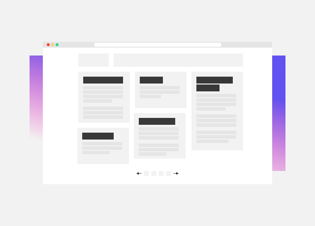
An example of a page with a convenient structure: the text is divided into paragraphs, has short headlines and a slider
On an unfamiliar page, I first review the headlines. If they interest me, I study the whole page in more detail. First I try to understand the structure of the page, then its content. And if by headlines I realise that there is no necessary information on this page, I close it.
Let’s take Google as a standard. If you are sighted, you won’t even understand that Google pages are adapted. For instance, all graphic elements have alts – short text descriptions. The emphasis in the structure of the page is on the headlines. I think it's good for the sighted too.
Tables are not convenient
The interface now has problems with everything related to the implementation of tables. A table is a way to present a large amount of information. If for the sighted people you can just highlight the information you need, for the blind ... I don’t have a solution yet.
I can’t remember any ticket sales service, which would be convenient to use. I tried to buy tickets on the Russian Railways and Yekaterinburg city bus station websites – and I just left it in the middle.
At the meeting, we asked Mikhail to try to find a suitable flight and buy a ticket. When he was tapping on dates in the calendar of the departure dates, the screen reader did not voice the date and cost of the ticket, but, instead, it was saying something like "cell one", "cell two". Mikhail did not even realise that he was going through the calendar, although he was looking for it. He was absolutely disoriented and we suggested to finish the experiment.
This situation shows how important it is to pay attention to seemingly imperceptible things, for example, to check metadata. It isn’t visible in UI, but this is exactly what is voiced by the screen reader.
It's good that big search engines like Google and Yandex have avoided using tables and made SERP (search engine results page) convenient for the blind. There are shortcut combinations – for example, by pressing Alt + 1, you can click on the headlines. Regarding the issue with the search results on the ticket sales websites or the Russian Railways – well, probably, they just did not think about it at the development stage.
About life in society
A crisis is a common state for everyone
I graduated from the medical university, studied to be a masseur and worked at the Institute of Occupational Pathology for 15 years, rehabilitating people. There I noticed that everyone has their own experience of overcoming life crises and that everyone can be useful to us. For the living environment, a crisis is a normal state. And the crisis that people with disabilities managed to cope with, is useful for society. Their experience should be studied.
For 15 years I didn’t understand why a blind person should travel
You come somewhere – they tell you something. But somebody can tell you all this at home too.
The first time I travelled I went to Dusseldorf. There was an organised trip when they take everyone for a city sightseeing tour. I thought I could’ve just stayed home – just to imagine that I was in a different city, put the audio guide on and that's all.
There was another blind girl there and after the sightseeing tour, we decided to run away to the supermarket together. I didn’t know a single word in German. She only remembered something from the school program. At the supermarket, we were told by the security that they didn’t have special staff to assist blind people and they sent us to another store.
But there are amazing grandmas in Germany, just like the ones in Russia. One of them helped us to buy an ice cream. (It was the only word that we remembered in German). By the way, I didn’t understand a word of what she was saying, but the impression about her was wonderful.
Mutual understanding is the most important thing
We were travelling through Germany from Dusseldorf to Cologne, and we were offered to go back by a tour bus again. I thought that this way we wouldn't understand anything at all about Germany, and we decided to go by train instead.
It is important to immerse yourself in the atmosphere of the language and into relationships with people. To do something blindly, you need to be understood. In case of regular tourists – everything is thought out for them. But if a blind person approaches the locals, they don’t know what to do with it. The search for mutual understanding begins, and the language is not important here. What’s really important is the desire to communicate.
About an accessible environment
It must be done the way that it does not bother anyone
Everyone has heard about what an accessible environment is: there must be ramps, elevators and all that. But there are so many demands in the law that if we follow them consistently, we will end up with a space that is not suitable for anyone. Because tactile tiles will be bothering people in high heels, ramps – someone else…
Let’s take an elevator as an example. Today, many of them have Braille inscriptions on the buttons. But if the elevator does not say on which floor it just stopped, then it turns into an interesting quest for a blind person. It seems to be done as required, but there is no real use in it.
It’s important to know where you are at and where you are going to
The most convenient way to describe directions is on the clock face. For example, from the entrance at nine o'clock. It’s easier than "to the North-West."
For the blind, it is important to understand where you are at and where you are going to. And you can’t really rely on the automatic route planner on Google Maps in our situation. I use the GetThere navigator, which tells me: "You are close to such and such a building, you are coming from this street to that”. It does not build routes.
Beeping traffic lights are disorienting
Somehow it has evolved in the world, but not in Russia yet. We put a traffic light in the city centre, which beeps so loud that you can hear everywhere... It bothers everyone, doesn’t help anyone but, at least, you can tell that the city thinks about the blind population. All over the world, these traffic lights are now adapting to the noise level, and the sound is directional.
When we went to check these traffic lights together with the city improvement committee, I asked one of them:
- Do you personally understand, which way to go here?
- I don’t, but the blind can hear better!
- The blind are the same people, they just can’t see.
- Really ?! That’s strange ...
As a result, these traffic lights were removed.
When all four traffic lights begin to beep, you just get confused and don’t understand where to go. And there is a stereo effect in the middle of the intersection, which only worsens the situation. You think that you cross the road green, but it turns out the other way around.
Conclusion: about the ideal interface
The real art is to create a unique product, by keeping the traditions. Everyone wants to make their own interface. For example, if this button is the same everywhere, people think that it is not innovative or creative enough.
But the ideal interface is the one in which there are no surprises and for which a minimum of effort is spent. You just accomplish your task instead of studying the new interface.
As for us, shortly before the meeting with Mikhail, we began to adapt one of our large projects for blind and visually impaired users. And this meeting was more than useful.
Personal experience from real people is an important part of UX development. And every time you face it, you feel like the scales fall from your eyes. Getting rid of illusions – that’s what users give to the designer time after time. And to thank them in some way we just need to try our best to make interfaces more convenient.
You might also like
