30 September 2021
Sharing our opinion: How to make a user-friendly website
Since 2004, we have been engaged in interaction design and develop clear and user-friendly interfaces. In the new article, our CEO Alexey Kulakov has shared some advice on this matter.
In the article "How to make a user-friendly website", you will learn:
– what is the difference between user goals and business goals, and how to take them all into account in one interface;
– how to formulate the task of designing an interface;
– what usability metrics exist and how their hierarchy differs for different sites;
– what is the difference between UI and UX, and what is important about them.
Read the full article below.
My name is Alexey Kulakov – I am the CEO of the digital production company JetStyle. For over 15 years, I have been engaged in interaction design – designing user-friendly interfaces with a user-friendly structure.
During this time, many trends have changed, and the designer's focus is finally on the experience they create. This is especially noticeable in an environment where many channels are used for communication: websites, messengers, video, audio, email, offline experience, etc. But it is no longer possible to create a design only as a set of screens – it is getting worse and worse. Therefore, more and more often, we are focusing on creating customer experience (CX) and user experience (UX) within it.
In this article, I will explain how a user-friendly website works. Together, we will look at what scenarios of user behaviour exist and talk about how UX differs from UI, and about the tasks of site navigation.
User-friendly website – what is it
Firstly, it is a site that fits well into the client's scenario and fulfils the person's goals. Secondly, it has good usability – in other words, it is convenient to use.
What does “fit into the user's goals” mean, and why is it important? For example, an 8th-grade student on his way home saw a poster with Batman and Superman and the caption "Programming Superheroes." He doesn't know what it is, so he can only go to the specified site and see the information if the message catches his eye. What should he understand and do so that we can consider this experience a success? That this is a cool competition for children aged 12-17 years old who know how to program, that it makes sense to participate in it – and sign up for it. To do this, he must see the main thing on the site: why the competition is cool, what value will he get from it. And then there should be an easy way to register. In the end, we need the student to upload his project – this should be clear and simple for him too.
If the site is not built into a person's scenario in any way and does not help them achieve their goal – to solve the problem with which they came here, then no matter how hard we work on usability, no one will appreciate the convenience of the interface.
Ask yourself a question: what kind of work does the site do for the user? How will a person's behaviour or life change after interacting with the interface? Within the framework of any commercial task, we always act only for the purposes of the business and the client. And we proceed from the axiom that we need to find the place where the goals of both are achieved. So, user-friendly is, first of all, about the client's goals.
A person's goals and user behaviour scenarios
A goal is what a person generally acts for: an idea of how life will change after interacting with a product. The user's goal is not necessarily the purchase of a product, but it necessarily changes their behaviour the way they want to.
In real life, goals are usually nested in each other like matryoshka dolls, and a person can turn to the Internet for any of the levels. For example:
-
I want to know how to get to the company office,
-
because I want to make sure that I won't be scammed (and I only trust face-to-face communication),
-
to make the final decision on the choice of the bike model on the spot,
-
and finally, buy it,
-
because I want to go to the city by bike, not by car,
-
because I hope that this way I will increase the rate of movement and finally lose weight,
-
I will feel better,
-
and I will like my reflection in the mirror.
Ultimately, the goal of a person here is to "like their reflection in the mirror." But for the interface design, we are interested in the goal in those terms in which the user sets it for themselves, opening the browser for "this one task." If they have set a goal for themselves – "I want to get into the company office" – you must first help them with this. Understand what tasks they face (in this case: find the addresses of the company offices, correlate them with the places they regularly visit, decide when they will go there and from where – from home or work, choose the mode of transport, figure out the route and not to forget all this until the moment of visiting.)
These tasks will be compiled into a scenario that should help you read the interface. After we have helped the user solve the problem for which they came to us, we can continue the scenario, moving on to the next goal, and invite them to continue the dialogue with our site. For example, about what models of bicycles we have.
Examples of goals:
-
I will buy a new Huawei phone. This time, from a reliable seller, and finally, I will be able to take pictures of decent quality (I have already decided on the model, and I need help with choosing a seller).
-
I will decide whether I want to buy a treadmill or not. If I do, then I will understand which one and how much money should be set aside from the budget (I still don't know if I want to buy a product at all, I need help with making a choice).
-
To choose a company that will install flooring in my apartment (I have already started plastering the walls, and I urgently need another company instead of this one – I need help with changing the contractor to a more reliable one).
At the same time, the business has its own tasks for the site:
-
to receive payment for the order,
-
to register a user,
-
to achieve filling out the form,
-
to get data from a survey,
-
to get permission for the subscription,
-
to sell a new tariff plan.
Before setting tasks on the site, you need to describe what scenario occurs in a person's life:
-
How a person has got a problem.
-
How they moved to solving it.
-
What steps should they take without your site or application?
-
How they've got a profit, or why they failed.
-
Where did they go after completing the scenario?
And then, when designing the site, to propose some changes: so that the situation becomes better for a person, and their scenario changes relative to the current one. The third and fourth points of our list will change:
-
What steps should they take using our application/site?
-
How they have got a profit, and how the situation became better.
For this change in their life to take place, it is necessary to understand what barriers are hindering them now and to remove them in the process of communication. Example: a person is looking on the Internet where to watch their favourite TV shows? What are their barriers?
-
“I don’t know how to choose a streaming service and whether there is a large library there”;
-
“I don’t understand how much it should cost”;
-
“I have no trust in this service, is it really suitable for me and my family? Will my child be able to use it safely? "
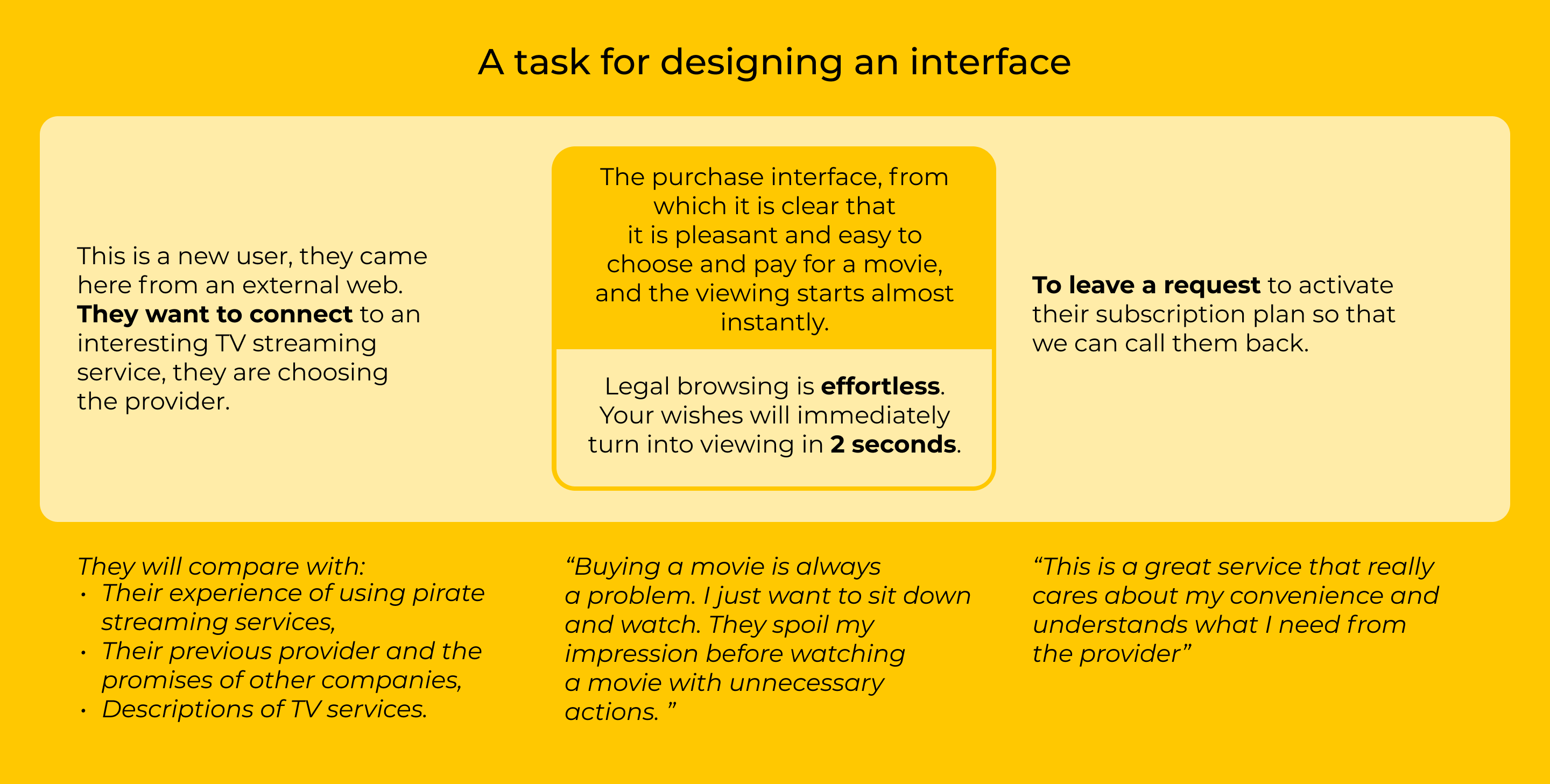
Ultimately, the task of designing an interface looks like this:
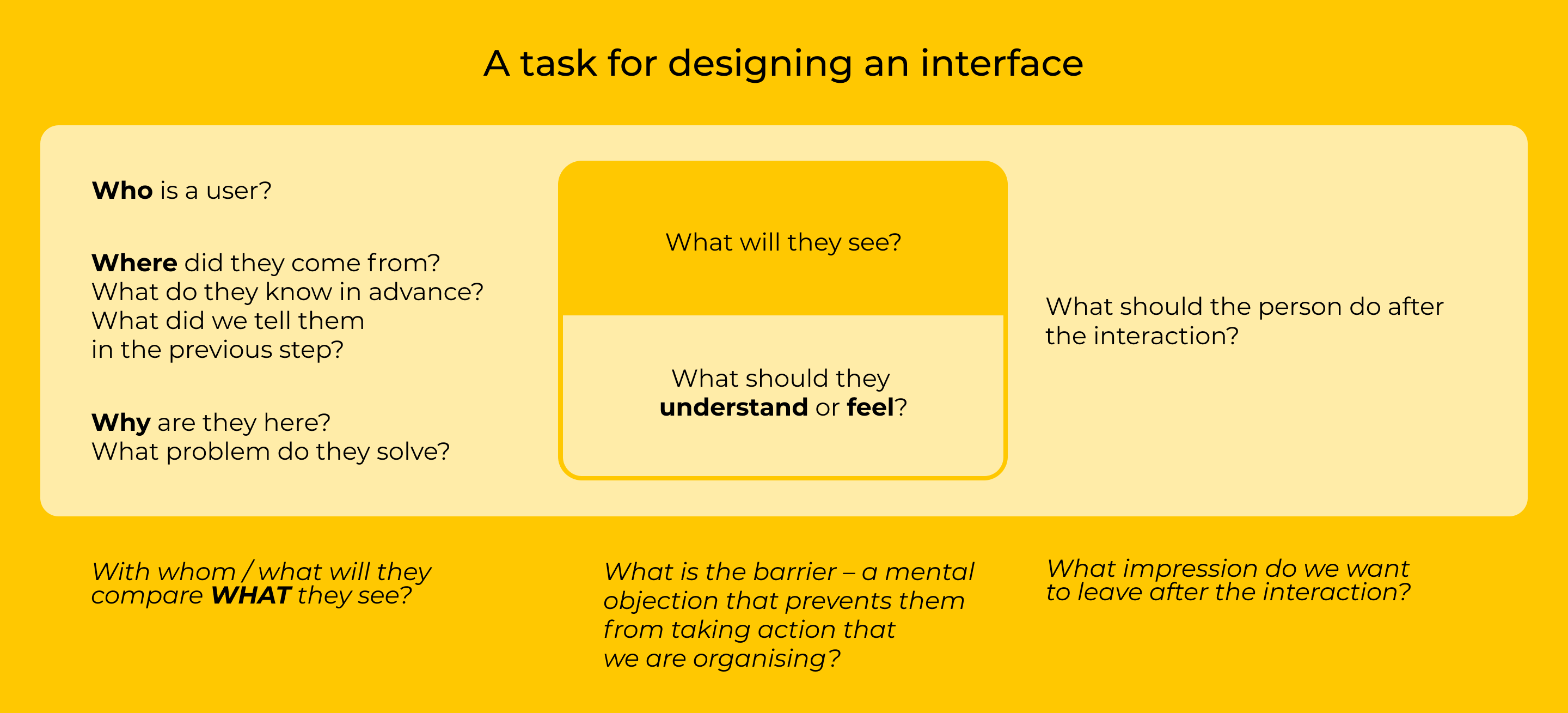
Examples:
Let's review our journey:
1. First, we describe the scenarios – how the user moves towards the purpose of their visit.
2. We fix the moments that should be in the scenario for solving problems.
3. We compose them on screens. We give the screens names so that it is clear what is happening there.
4. We draw a page navigation map.
Site usability metrics
We made sure that there is some benefit to a person on our site – this is the base. The next level is the level of comfort. Now we need to make sure that the site is user-friendly, ergonomic, and in line with usability standards.
In usability, I usually use the following metrics:
-
Learnability. You immediately understand where you are, what you can do here, how the interface behaves - you don't need to guess about anything. Learnability works well if you come to the site and get it right from the start.
-
Memorability. For example, it was difficult for you the first time to understand the interface, but you come back after three weeks, and you know what to do.
-
The percentage of user errors is a negative metric. The errors can be minor and critical. Critical is when the user was unable to complete their task: they came to the site, clicked and clicked, failed to cope with the task, came to a dead end. There are non-critical errors: when the user's idea of how the interface will behave is at odds with how it actually behaves but the scenario is still executed, the user reaches their goal.
-
Efficiency. The user makes some effort to achieve their goals: this effort can be measured in the time the user spends to achieve their goal or in the number of clicks. High efficiency is when a person needs to put in little effort to achieve a task. Ideally, the problem should be solved without effort at all.
-
Subjective satisfaction. If the previous metrics can be measured by looking at the user from the outside – just looking at what they are doing – then we will not understand the level of subjective satisfaction without talking to the user. Satisfaction is influenced not only by these four metrics but also by image conformity: to what extent does the user's idea of how this site looks coincide with reality, and what is the tone of voice of the content. To what extent does their impression coincide with the fact that the site is for people like them, in its current context. Ultimately, the client either likes or dislikes using the interface.
The hierarchy of these metrics will vary from site to site. Here are some examples:
-
For example, if we are talking about a one-click purchase scenario when a user first encountered a landing page, bought something, and we no longer interact with them, then the main metrics that are important to us are learnability and the percentage of user errors. And we will optimise the site for them. But in 2021, the case when the client came, saw and bought is not the main one.
-
Work with a repeat purchase. If the user has already answered many questions, don't force them to repeat unnecessary operations. It is important that they can quickly remember the navigation logic and repeat the order. It would also be good to show care and appreciation – for example, to offer a discount for a repeat purchase.
-
A long-term sale. Often users don't buy on their first visit – help them and show what they viewed last time, and offer to subscribe to the newsletter. The site should help in telephone sales: it is very important to have easy-to-explain navigation in a conversation (simple addresses, a clear structure of a separate page, clear zoning).
The difference between UX and UI
We need to understand what value we bring to the client, get into their context, have an assumption of what is familiar to this person and make the interface by offering them good content or service. We are engaged in user experience – creating a valuable user experience, improving conversions, designing scenarios and content. UX is about how the user behaves, how to measure and design this behaviour, what to talk about.
User Interface, in turn, answers the question "what does the interface look". UI includes:
-
what the service functions look like – visual fitting of a dress using augmented reality, the ability to add a product to the cart or favourites, comparison of product parameters;
-
patterns: tabs, radio buttons, buttons, links, swipes;
-
screens – main page, search results, product page, shopping cart page;
-
modules are visual "phrases", for example, registration form, the lead paragraph of an article, etc.
For the user to be comfortable, you need to deal with both UX and UI, but the UI must be subordinate to the UX.
Recommendations for UI:
-
The main focus is on the main actions. When you are on a screen, you need to clearly understand which scenario the screen is dedicated to. The interface elements associated with the main scenario should be in a prominent position. It shouldn't be that the most important value that is in the interface is behind some plate in the third screen from the top – no one will see it.
-
When you arrange items on the screen, there should be an explicit hierarchy of item visibility. You want to show something to the client first, something second. This is similar to perception in the visual arts: what is in the foreground and in the centre of the composition is large, what is in the middle – shades it and enters into a dialogue with it, what is in the background does not stick out its details. This rule is used to choose the contrast between the size and appearance of elements. The contrast should be clear.
-
The required minimum of design styles. Styles are the words and rules of the visual language that you use. The user spends mental effort on mastering the patterns, so few rules should be introduced and adhered to in all interfaces. So the user will quickly understand how everything works here, and there will be fewer errors. In addition, when we read visual patterns and understand that everything is neatly organised, the space is perceived as more enjoyable.
-
Navigation should answer the question "where am I":
-
this is the product page,
-
these are the search results,
-
this is the main page of the site,
-
I'm at the checkout page now, etc.
And also the users must understand where they are in relation to other pages of the site: how to get back to where they came from, where they are in relation to the main page, etc. The third navigation task is to answer the question "what can I do here?"
-
The mobile experience should be designed first. In 2021, in almost all scenarios, a person gets more than half of the experience through a mobile interface. In addition, when designing a mobile interface, you will have to concentrate on the main thing – after that, it will be easier to arrange the desktop version.
-
The fast loading of elements is another important factor that directly affects almost all usability metrics. It also strongly affects search engine rankings.
-
Support for native controls. When someone says "intuitive" it actually means "familiar." Therefore, if you can get by with a standard interface element that the user often encounters (they are exactly what are contained in the operating system guidelines), such an element will be more convenient. Because it is already present in the experience. You need to have very, very strong arguments to enter the original control characters.
-
Continuing with the subject of native controls, we should talk about inclusiveness. If you put in the effort to make your site accessible to people with disabilities, you will kill many birds with one stone. Firstly, there are tens of percent of such users – these are not only people who cannot see the screen at all (and need audio interfaces) but also visually impaired people, people with colourblindness, attention disorders, etc. For almost any client group, this is a significant segment of the audience and is worth taking care of. Second, if you take care of them, you will have to adhere to stricter information architecture and normal accessibility (interface accessibility). This will lead to the fact that you will have to use standardised practices that will make it convenient to work with your site from all common agents - not only the most common parsers, but also voice interfaces, aggregators, and special reading tools.
Instead of conclusion
The most important advice would be something like this:
to be convenient, the interface must be familiar. You need to stand out with the content and value that the service creates.
To do this, conduct a reference analysis – a very simple practice that is often neglected. Repeat the user's journey, go through their scenarios: go to the Internet, open the first ten search results for the query that users will encounter. Try to look at it with your eyes and, while doing this, take screenshots of all the screens that you come across. Pick out good examples and feel free to use them.
If you’d like to talk in more detail about user-friendly interfaces and mechanics that I use when designing, get in touch with me at kulakov@jetstyle.ru
You might also like