1 October 2020
Digitization of patient records: how to conduct a study and create a meaningful concept
This article is the result of our research, through which we developed a design concept for a patient's medical record. We want to use this example to show how we in JetStyle approach the interface development process.
When moving a business online, it is not enough just to move to the Internet. The most common mistake is trying to reproduce offline features online "as is" – that is to say, with all the artefacts and inconveniences that come with the physical process.
In fact, the first things to do are change the structure of the activity, design processes in a different way, and find new management methods. Let's analyze how to do this using the example of the concept of creation of the digital medical record.
Where to begin?
When designing a professional interface, the UI designer often stops after designing an attractive dashboard with impressive graphics, inspired by the works of Edward Tufte or beautiful infographics.
But it doesn't work like that. Before working on the design, you need to understand what the participants typically require in the interface, what is used less often, while still being important, and what is unnecessary and should be excluded.
How can we determine what really needs to be changed? What algorithms in medical processes can we improve or even provide alternatives? How can we create a meaningful concept?
To answer these questions, we’ll analyze:
-
How to move from a general abstract setting to focusing on the main problems and their solutions.
-
A sequence of actions when defining a change vector, a general hypothesis, specific ideas, and a way of setting priorities between them.
-
The concept we created, based on the proposed scenario.
Part 1. How to move from a general, abstract setting to focusing on the main problems and how to solve them
Step 1. Highlight the work area
Our workflow is based on the "double diamond" model. The process phases tend to converge and diverge. These amplitude peaks clearly illustrate the extent to which we focus on particular and general things at different stages of the problem.
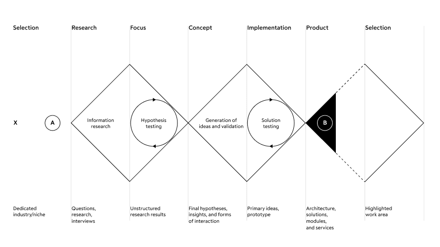
When working on the development of a complex ecosystem of products, it is necessary to return to the very beginning of the plan each time - the primary area of definition of the future product. The only difference is that subsequent returns to the beginning will include knowledge about previously implemented services. This is the only way to keep the system consistent and structurally prepared for subdivision into many work teams.
We moved from general to particular. For a start, we defined possible links between structures and their elements. In our case, it is between the main participants of medical processes: patients, doctors, clinics, and the state. We then refined them until we visualized the interface architecture as a module of an abstract structure.

To highlight a particular area of work, we need to understand which of the communication links has the most problems and make it the focus of the interface solution.
What problems are more critical and common for users? Why? Maybe because the process is not yet automated. Or maybe because the existing interfaces are cluttered and require a lot of time and cognitive resources? Or maybe because there are unnecessary loops in the process itself?
For our study, we chose a doctor/patient relationship and focused our attention only on these participants. However, this level of detail is still not enough - we covered too large an area of interaction scenarios, so we continued to clarify the role and context of relationships.
This is the context for which we developed the interface:
Doctor/Patient → Doctor → General practitioner → Context/Appointment
Step 2: Setting up goals and tasks
In a way, designers are like doctors - they also determine where it hurts; except for the fact that one sees a patient, and the other examines a process in detail.
Our goal was to build a new model for an interactive experience with a medical record that is better than the previous approach. The model should be based on solid knowledge and should include a way to ensure that it meets the user's needs. Therefore, we first created a complete overview of a doctor's workday. For this purpose, we chose methods and conducted research, after which we filtered and combined the information obtained into a Customer Journey Map.
The following is a comparison of methods, and their pros and cons.
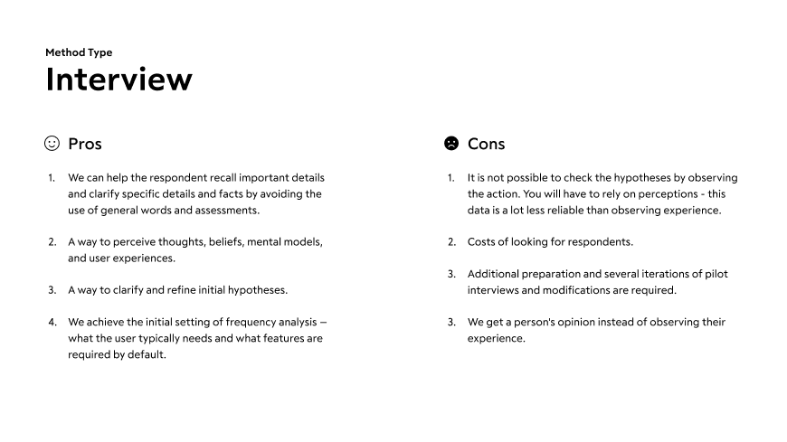
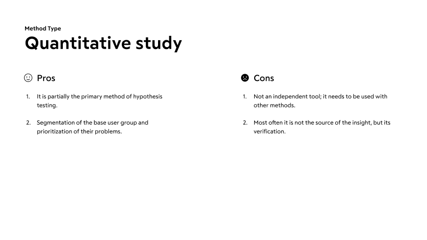
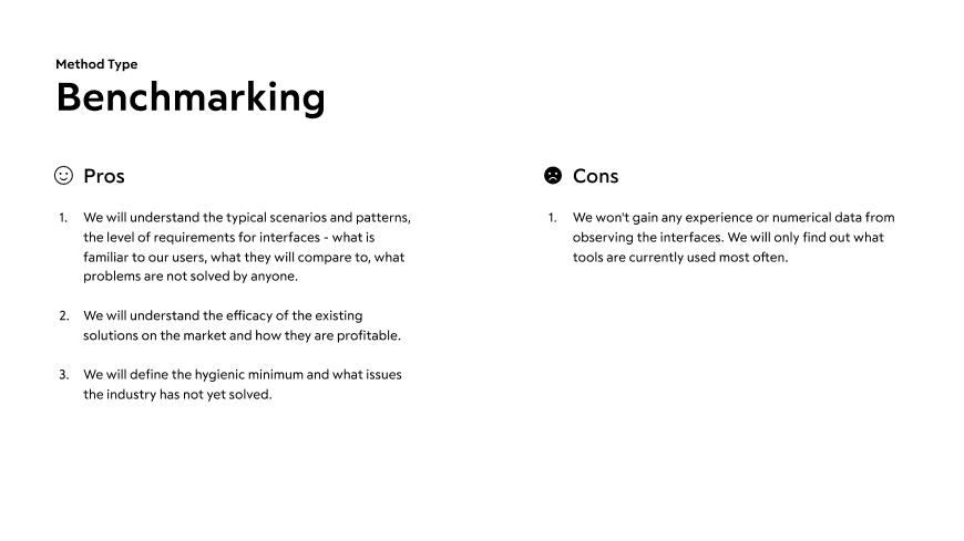
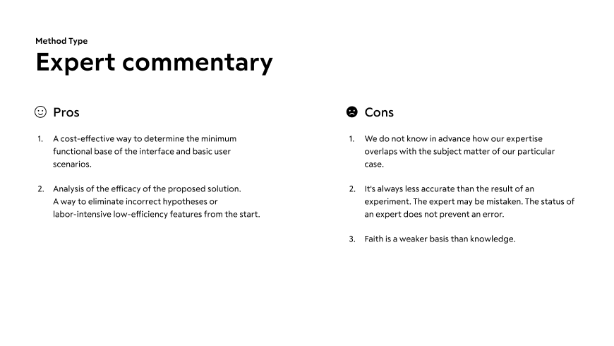
In our case, we used the methods that provided a more reliable result with less effort: interviews, quantitative studies, benchmarking, and expert commentary.
We then defined the tasks. In real life, we follow this plan – we need to:
-
Get an analysis of people's actual experiences as soon as possible
-
Start testing the interaction scenario on rough prototypes
-
Gradually improve the quality of analysis by incorporating finer and more time-consuming tools as you proceed (analytics that show results on a running interface).
Step 3: Interviews with users
At this stage, it was important for us:
1. To understand the daily algorithm of the general practitioner's actions: the frequency of operations
2. To identify the insights and nuances of the doctor-patient relationship: how trust is established between them
3. To identify the doctor's personal KPI
4. Also, to find out:
-
Pronounced desires and motivations
-
Beliefs, goals, values, and norms
-
Perception of the process
-
Hidden needs
You can check out (and later use for yourself) the interview plan with the general practitioner that we used.
Based on the results of the interviews with the doctors, we achieved a number of insights that we took into account when developing our medical record concept. Here are some of them:
-
In private clinics, the most important thing for the doctor is to get complete information on the patient in order to understand within the first three minutes whether the case corresponds to the doctor’s specialization or not. It is also important for the doctor to manage the schedule - to understand who is scheduled to see them today, and, if possible, to divide them into groups according to the types of requests.
-
State clinics have printed registered forms for reporting to the Ministry of Health. These logs are used to determine the efficiency of the clinic. Filling out the forms is an important part of the doctor's work and a task that he or she needs to perform personally if the clinic is not automated.
-
One particularity of the work of a doctor at a rural clinic is that there are many house calls. The primary filter before an appointment with a doctor is a paramedic. In most cases, an appointment at the clinic is scheduled through a call made by a doctor.
-
When diagnosing a child, the results of the child's tests (compared to those of an adult) are not as important to the doctor, because children have fewer chronic diseases.
-
Video conferences are held with relevant specialists for clarification and to make complex diagnoses; they can be held during the appointment.
-
10-15% of a doctor’s time is taken with healthy patients who need to visit the doctor to get certificates for their employers, for example.
-
In order to clarify drug dosages and minimize the risk of errors, doctors regularly refer to medical reference books and databases.
Step 4: Quantitative studies
We have used existing research results as part of the conceptual design.
The advantage of this is that they allow us not only to see the survey results at once, but also to reveal the changes in the dynamics. The main drawback is the impossibility to find a correlation between the answers and the main characteristics of respondents.
For example, we referred to the annual study of doctors' behavior on the Internet Doctor Index 2019. With its help, we found that medical professionals are actively using electronic devices, including smartphones, at work and even during appointments. From the same source, we learned about communication between patients and doctors outside the clinic.
Step 5: Benchmarking
In our search for existing solutions for our topic, we referred to the European experience. There, the healthcare system is primarily focused on providing quality services and a personalized approach to health and patient needs. In a number of countries, the digitization of the medical field began at the beginning of the 2000s and continues to this day.
The processes are integrated into the general communication between citizens and the state through official portals - analogues of Russian State Services. Depending on the country, data centers - the processors of a large array of patient data - are operated by the state or private structures with shared access or access on demand.
The services of start-ups that provide telemedicine services are used on an ongoing basis. With the help of these companies, doctors conduct remote appointments with patients from any location and maintain communication with them. This effectively transforms relationships, because a medical professional becomes an indispensable attribute of a healthy lifestyle, not a consequence of diseases.
Telemedicine itself is not new to Northern Europe. Back in the 20th century, sailors communicated with doctors by radio, if it was not possible to dock in a location.
Medical records, along with visit histories and medical prescriptions, are available to patients via smartphone applications. Current level of efficacy in visualization of such services leaves much to be desired, but the benefits of their implementation are undeniable.
A single access point for all process participants and the absence of bureaucratic paperwork costs save money for more important programs in the budgets of health ministries.
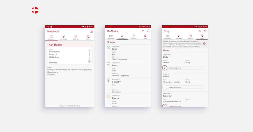
Denmark was one of the first countries in Europe where the medical industry was digitized.
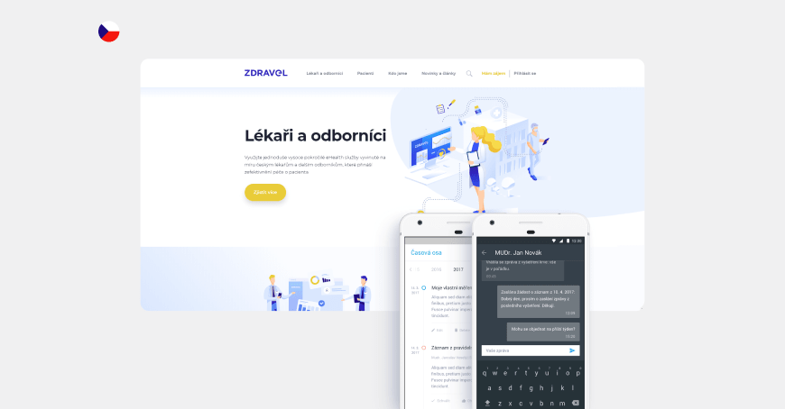
More than half of the doctors in the Czech Republic use electronic medical records. There is also a separate application for patients with information about visits, appointments, and the opportunity to communicate with doctors.
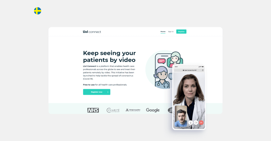
And in Sweden, medical professionals can use a free web platform for secure remote video consultations with patients.
In many ways, this gap in the development of the digitization of medicine compared to our country is due to a well-developed health insurance system.
Step 6: Expert commentary
When designing a working interface, there is not always time for a sufficient number of surveys and studies. We then need to rely on our own experience to solve such problems.
For example, for several years, we have been developing the ecosystem of the products of the UMMC-Health Private Clinic, which is one of the largest clinics in the country. As part of our collaboration, we have developed a website, a personal profile with the integration of data on visits and appointments, a mobile application, and a record form with an automatically updated schedule of more than a hundred doctors and the ability to select a branch without the involvement of a registrar.
We have also created a website for distance learning for doctors and CRM for dentists.
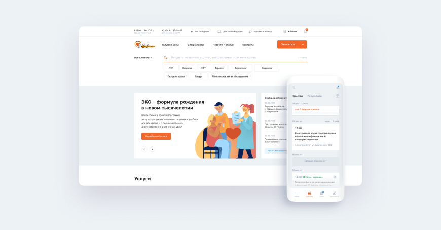
The main advantage of such experience is the understanding of the real availability of projected information and the degree of difficulty in obtaining it, as well as experience in integrating third-party databases and connecting services. In addition, we are in constant communication with medical professionals and gather their feedback throughout the entire project cycle.
Hypotheses, which we formulate based on personal experience, may refer to individual features as well as architecture or the service form factor. For example, we have modernized the familiar concept of the clinic's presentation website into a medical e-commerce site, offering the services of both doctors and diagnostics. This change has affected the entire ecosystem of products: using common rules of layout and display of blocks, we have established this arrangement and made network interactions with the clinic intuitive for all users.
Part 2. How to set up a change vector, a general hypothesis, specific ideas, and set priorities between them
As a result of the research, we learned the details of a doctor's working day. Then, to develop the interface concept, we divided it into seven phases, each phase was written out, we proposed ideas for implementation in the interface, and we finally came up with a general hypothesis. We put together the CJM of the doctor's working day in table format.

1. A general hypothesis
By reducing the time required to manage documents and introducing new tools, doctors will be able to:
1. Treat their patients with greater attention. In the future, this will increase patients' confidence and help remove psychological barriers in the course of treatment.
2. Achieve KPI without compromising the quality of appointments and examinations.
3. Improve the speed and accuracy of diagnosis by providing a more relevant and visible context in the patient's clinical picture.
2. Focus on specific ideas
We think that changes in the interface should contribute to a paradigm shift in the doctor-patient relationship from "I only need the doctor when it hurts" to "the doctor helps me lead a healthy lifestyle."
It is important that the medical record provides opportunities for prevention without a doctor: giving recommendations on what the patient can do in advance or on their own. That way, it is not only a doctor that will help you lead a healthy lifestyle, but a combination of a doctor and a card.
3. Validation and prioritization of ideas
When drafting concepts, there is often a tendency to let the imagination run wild and do all the work. On the one hand, this is good, because this approach allows you to find unconventional and creative solutions. On the other hand, such solutions often differ from the technical capabilities on the market, require disproportionate costs, are aimed at visual presentation and not the user's experience, or do not coincide with their actual need.
How, then, can we understand what features to offer in your solution?
We have adopted the RICE prioritization technique where each concept or feature is evaluated based on four parameters and eventually receives a certain number of points:
-
Reach
-
Impact
-
Confidence
-
Effort
At the beginning of the implementation, the concept must be flexible to change - we will get a lot of feedback from real users and, subsequently, something will work completely differently than originally expected by the team. Therefore, some aspects will have to be reworked and others removed.
And, clearly, we can't discuss reach at the inception. Therefore, we have added another more important parameter at this stage - the degree of influence on the other features (Network Effect).
First, we need to offer a feature that will be used in more interaction scenarios and could potentially become the basis for minor but useful features in the future.
In practice, this usually means:
1. Choose a sufficiently flexible general form.
2. Develop a dictionary of basic "interface words," so that a small number of entities can cover the variety of cases we need.
3. Define the basic work of the interface and compare the results with the hypothesis.
Features with a high level of Network Effect (NE) should form the basis of the concept. They can be called the ‘backbone.’ With the development of the service and its scale-up, the NE level will become less significant for defining the priorities of the features, but still meaningful among other RICE indicators.
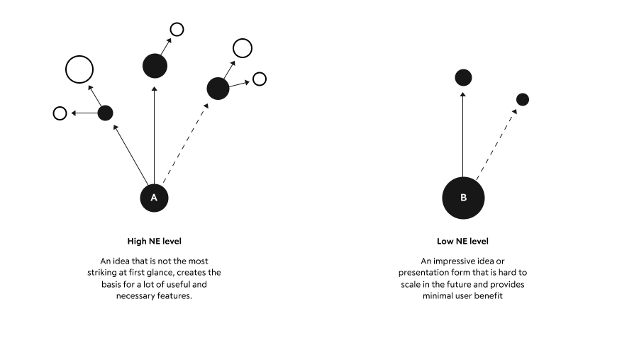
For example, in our concept, we have abandoned the usual entry forms in favor of free input with context hints depending on the type of document and the doctor's specialty.
In addition to the obvious advantages - convenience and speed - this solution prepares the basis for the possible introduction of voice input and automatic text recognition in the treatment. It also allows doctors to customize or refine diagnoses with diagnostic and examination results using integrated blocks.
There are also disadvantages. First, expensive machine training may be needed to implement this idea. And, secondly, older doctors may face difficulties when switching to the new interface.
Read more about RICE and the Network Effect in this article by Anton Iokov from Targetprocess: “Enhancing prioritization with networks.”
Part 3. Creating a medical card concept based on the above
In this part, based on the research carried out, we will consider the peculiarities of some stages of concept creation and the concept itself, which we have developed.
Layout
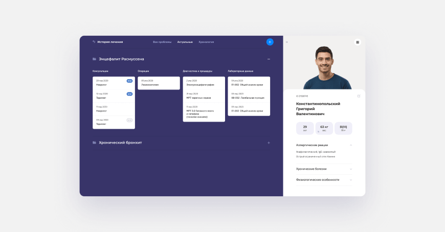
The patient's medical record, accessed by the doctor, is divided into two areas, based on the initial problem - to quickly read all the information necessary for the visit.
On the right is a block with information about the patient. It reflects their physiological data, as well as diseases that strongly affect the possible treatment or limit contact with the patient, including allergies. This area involves its own scroll; so, if necessary, it can be supplemented with any relevant information and does not prevent navigation in the main area on the left.
On the left, there are several navigation options. The first is navigation through the main sections of the patient's medical record: profile, diseases, tests, etc. It also has an additional indication of the presence of types of diseases according to the international classification of diseases.
Open dashboard with snippets
The second option is a special dashboard with a treatment history and widgets. With this tool, the doctor quickly identifies the patient's latest interactions with medical structures and has access to all relevant data – from test results to assessment reports. At the same time, documents are also linked to prescriptions, so they can be found easily.
Doctors' approaches may vary greatly, so we have thought about creating a custom dashboard with the necessary information for a particular doctor. For example, whether the patient is taking antibiotics or what the dynamics of a particular substance are in the tests. The variants of such events for the records are customized separately.
Open form for filling out documents
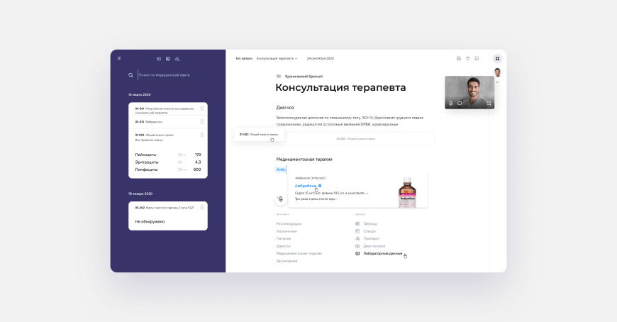
In order to reduce the time required to fill out medical records, we have abandoned the standard paper forms on the patient's visit in favor of easier information input and interaction with databases of diagnostics and lab tests.
All the doctor has to do on this page is start typing (or press the voice input button). The system itself will offer the necessary options for document design: select frequently used headings or attach test results.
Hints on the process of document filling are contextual, depending on the specialization of the doctor.
Examples of interaction mechanics
In the interface, the doctor can:
1. Attach a document to a certain disease or problem.
2. Click the "add test results" button, open the adaptive, filtered data dashboard, and drag the test results into the document body so they can be printed.
3. Get all the necessary information from the system to describe the drug treatment, make a diagnosis, and fill in complex data types.
4. Work in remote mode.
Remote work with the patient
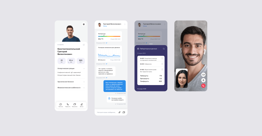
Communication with the patient is not limited to chat or video communication. For example, the patient can check their test results in the chart using the snippet mechanics - data cards that are inserted into the body of the document or in the chat dialog box. And the doctor, using special forms, can form requests for measurements of health parameters, such as temperature, and record them in the system.
In summary
A consistent approach to solutions allows you to work successfully on tasks whose problem is expressed in abstract or implicit form. Communicating with users helps to rethink existing solutions and identify the places that need fundamental changes.
It is possible to invent your own methods of defining users' needs or modernize the existing ones - everything depends on the context not only inside the task, but also in the area it originated from.
The concept that is developed must contain the prerequisites of a form that can be used at different levels of interface interaction. There is no need to focus too much on details, so as to not lose sight of the threads that will link and make the different interface screens intuitive. It is necessary to highlight the basic scenarios and be able to execute them in a flexible way with a small set of interface primitives.
P.S. In the next article we will select other participants of the doctor/clinic process and show how we scale the principles and rules from this article. In the meantime, we are happy to discuss this one!
You might also like

