11 February 2020
Case study: Redesign of the Haier online store
Starting from this week, we will be showing our recent projects that have become winners at the Tagline Awards 2019. From portals for doctors and a promo site for a museum to the magic of AR and VR and WebVR site for the White Tower – there’s so much for you to see!
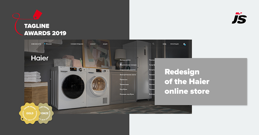
The first one on the list is the redesign of the online store we did for Haier. This project has won two awards: Gold for the Best website in retail, and Bronze for the Best website.
About the project
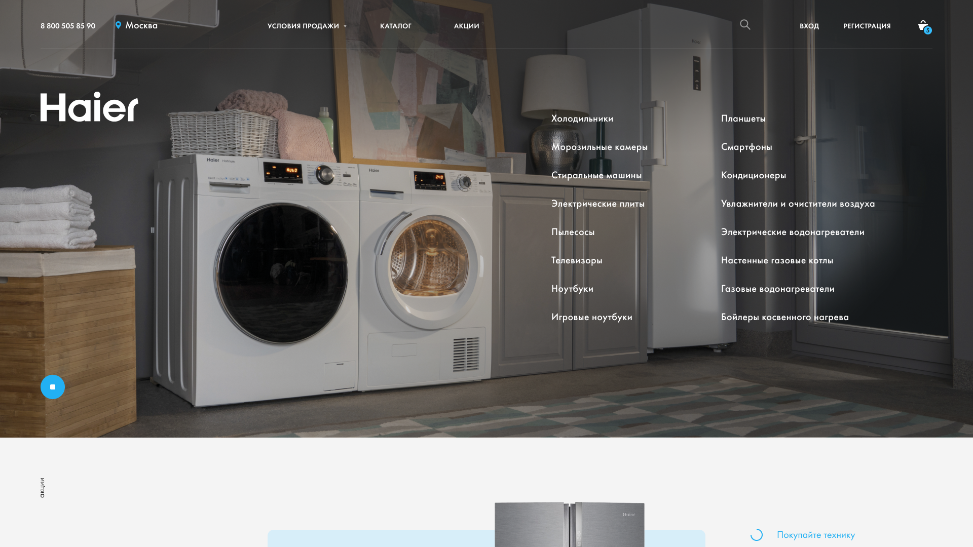
Redesign of the Haier online store has become one of the tasks in a complex project: redesign of the corporate website, development of banners and promo pages.
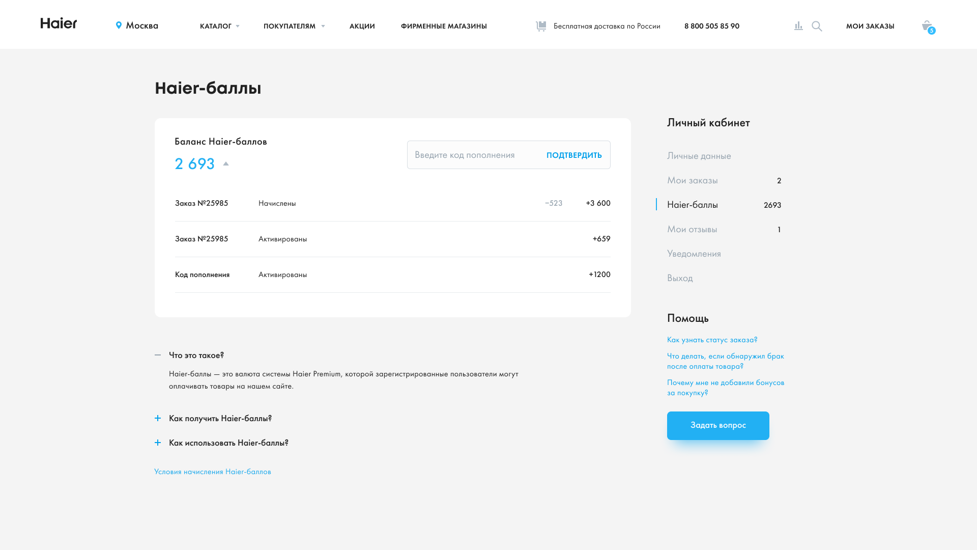
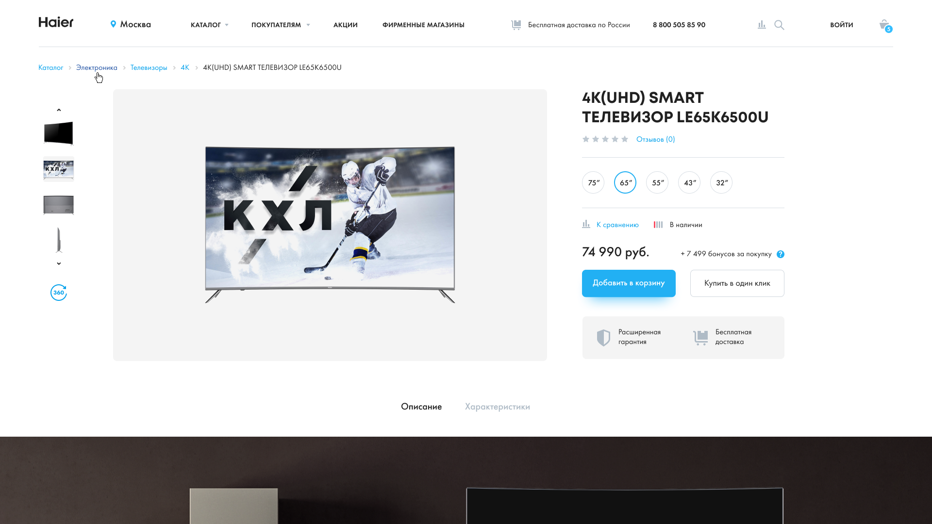
The new online store reflects the image that the manufacturing company wants to convey to Russian customers: Haier is a high-quality and environmentally friendly affordable home electronics and household appliances. Buying in a new online store requires a minimum of actions:
-
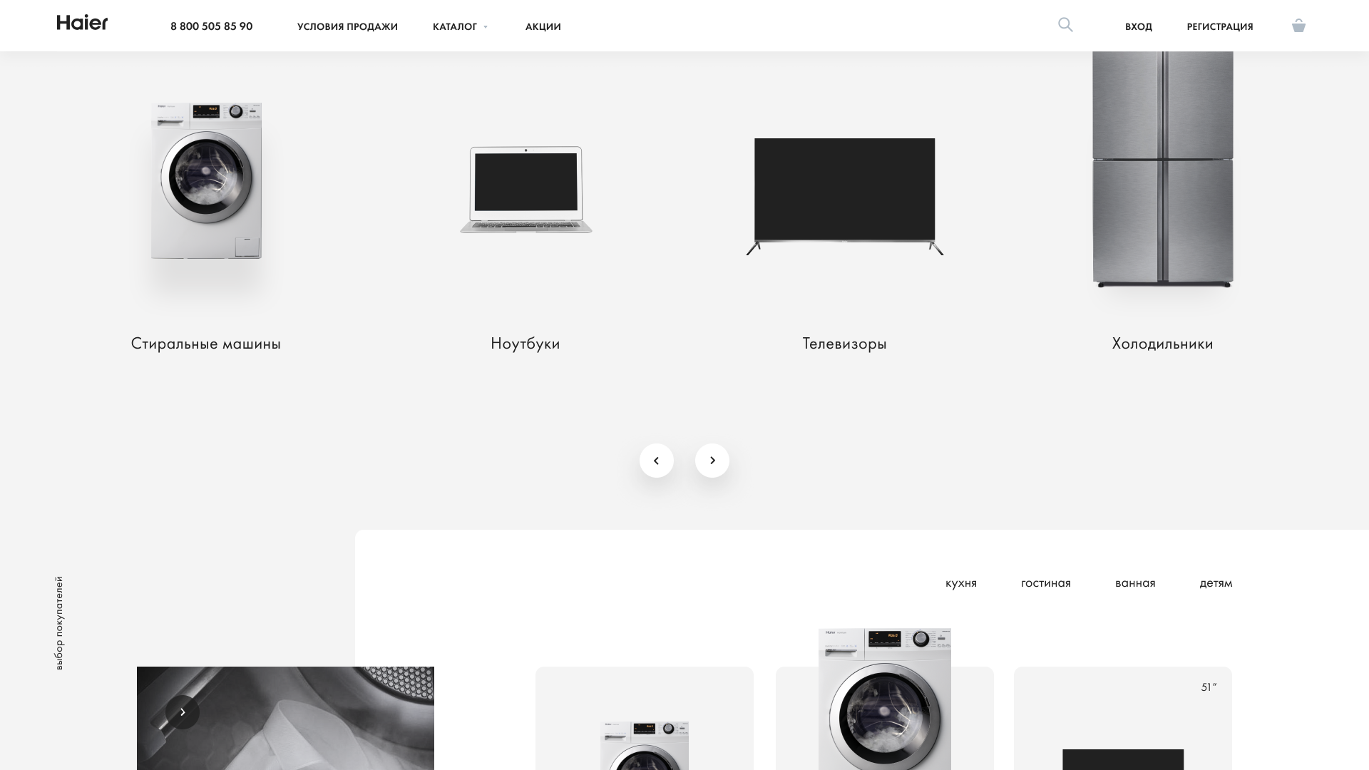
catalog on the homepage,
-
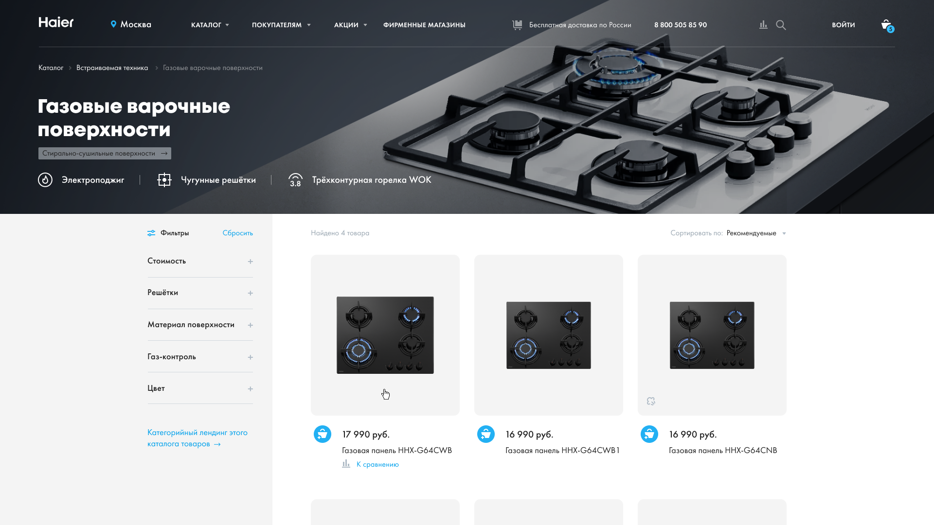
convenient filtering and comparison,
-
quick registration at the checkout stage.
Challenge and solution
In the process of working on the online store we:
-
conducted an audit of the previous online store, fixed navigation problems and simplified the ordering scenario,
-
updated the style and conveyed the image of Haier as a manufacturer of reliable, beautiful and affordable home appliances,
-
made the online store adaptive and convenient for choosing appliances and making a purchase on any device,
-
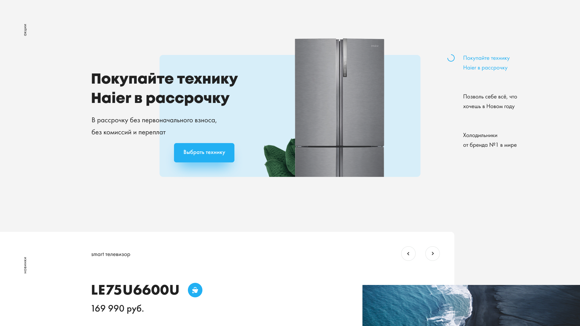
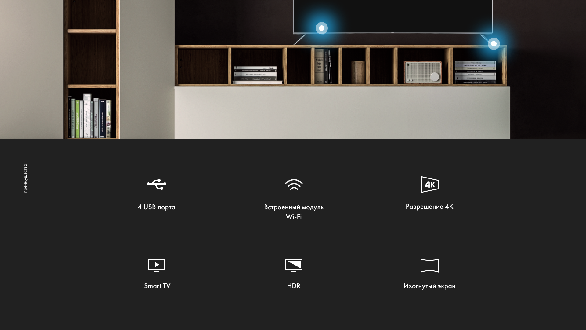
created 4 promotional pages dedicated to certain categories of goods, and built them into the directory structure.
Promo pages tell about the benefits of the brand's home appliances and unique developments patented by the Haier engineers. They help to make a decision to those who came to the landing page from external sites, and those who wanted to learn more at the stage of choosing and comparing different models in the Haier online store.
Promo page about washing machines
Promo page about air conditioners
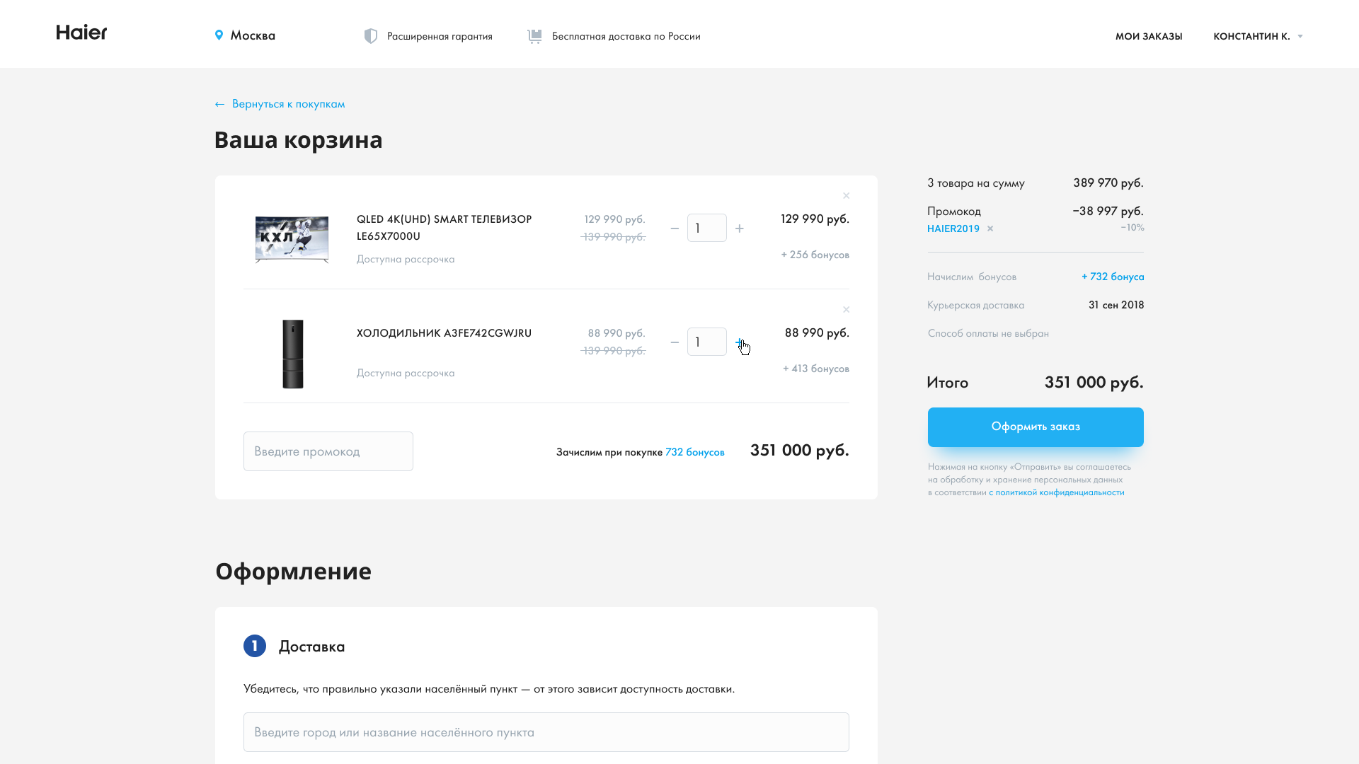
Achieved goals and KPI based on the launch results
After the redesign of the online store, the transaction rate and the number of transactions increased.
Transaction rate:
-
from mobile devices increased by 28.5%
-
from desktop devices increased by 21.8%
Client’s feedback
We are already receiving positive feedback from both customers and partners. Everyone says that the online store has become much more convenient in general, with a nice mobile version. We have set up the analytics after moving to a new site, and even after two months, it is clear that the results are great. If we compare the current figures with the ones from June and July 2018, the figures for this summer are much higher.
You might also like
