26 February 2020
Case study: Design of personal accounts for Insis
Insis is one of the largest telecom operators in the Sverdlovsk Region (Russia), providing a full range of telecom services. We have been collaborating with the company since 2014, and during this time, we have developed a new website, a set-top box interface, and many other interesting projects for them.
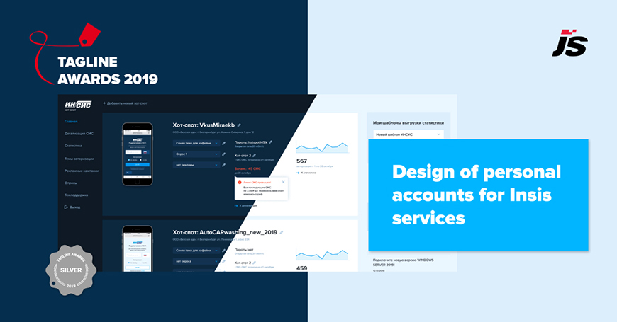
Today we will tell you how we redesigned personal accounts for Insis services. This project has won Silver for the Best intranet design at the Tagline Awards 2019.
About the project
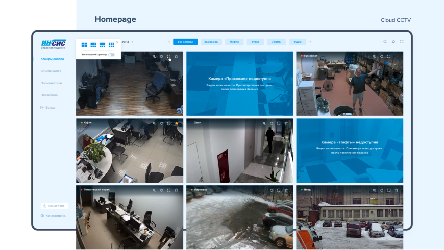
Insis (one of the largest telecom operators in Yekaterinburg and the Sverdlovsk region) has asked us to conduct an audit of the personal account of their “Cloud CCTV” service. Based on the audit results, we presented the design concept, within which we updated the style and simplified navigation.
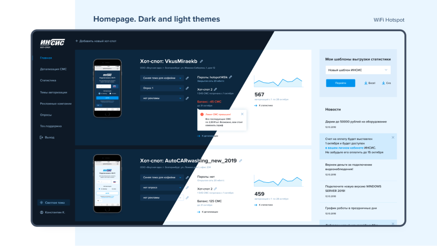
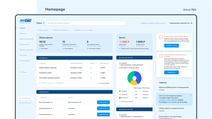
The redesign of the “Cloud CCTV” service personal account showed good results, and therefore it was decided to include personal accounts of all Insis services in the project. During 2019, we updated two more of them: “WiFi Hotspot” and “Virtual PBX”.
Pages about the services:
Challenge and solution
Benchmarking
We examined examples of the implementation of personal accounts of federal companies providing cloud video surveillance services, hotspots, and hosted PBX, and selected the most successful solutions.
Navigation
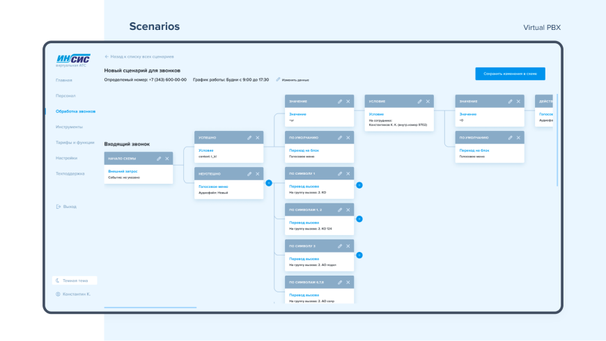
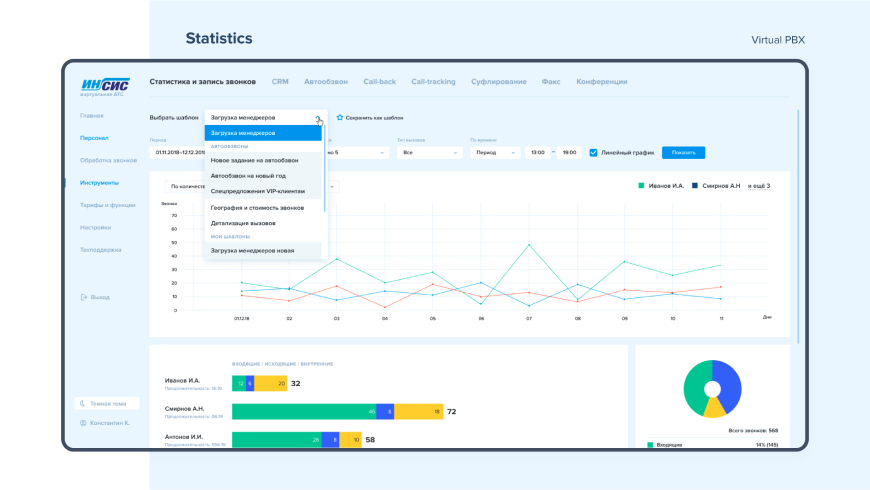
The services have existed for a long time, they were regularly refined, and due to the layering of updates, there was inconvenient and unpredictable internal navigation in personal accounts. We designed user scenarios and built the interface so that everything was clear to both new users and those who were used to the old version of the personal account.
Uniformity
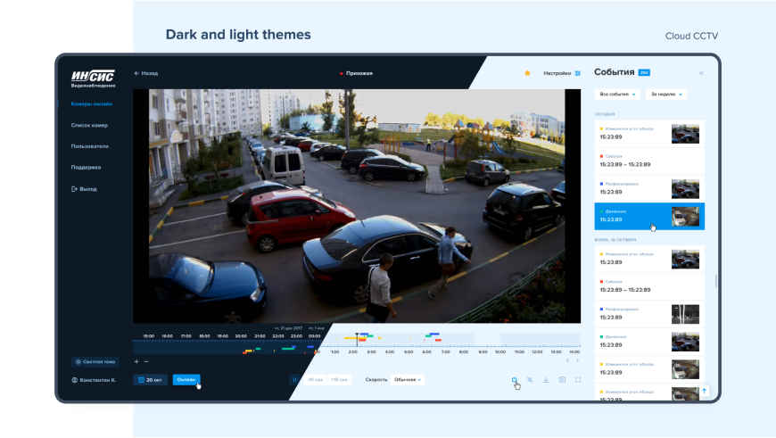
It was important to maintain not only the stylistic continuity of personal accounts with the main Insis website but also their uniformity among themselves. When switching from one personal account to another, the user doesn't have any discomfort or doubt what to look for, what their actions will lead to, and where to find the necessary information.
Dark theme
We proposed a standard light theme, familiar to users, and, following the trends, a dark, more contrast one. The second theme turned out to be very popular.
New features
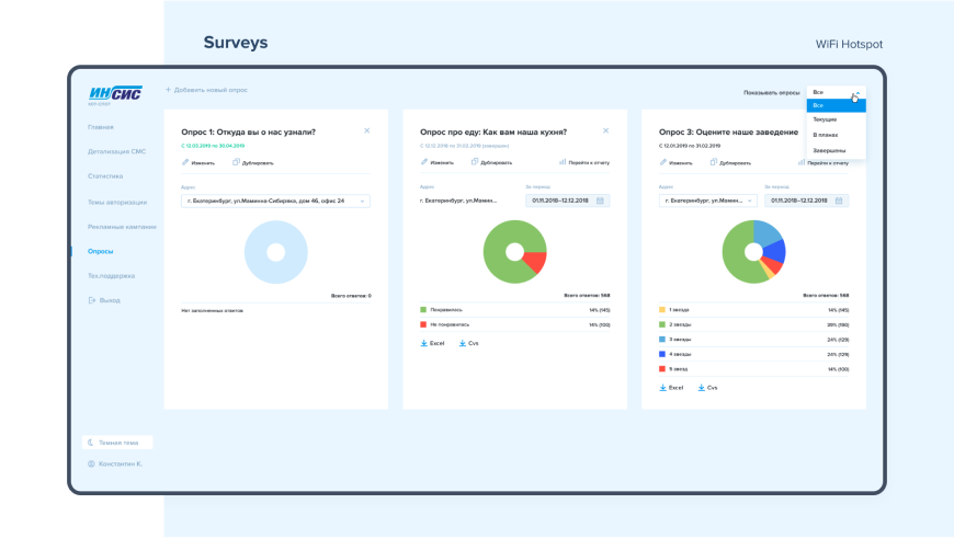
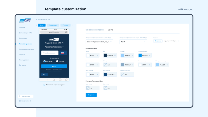
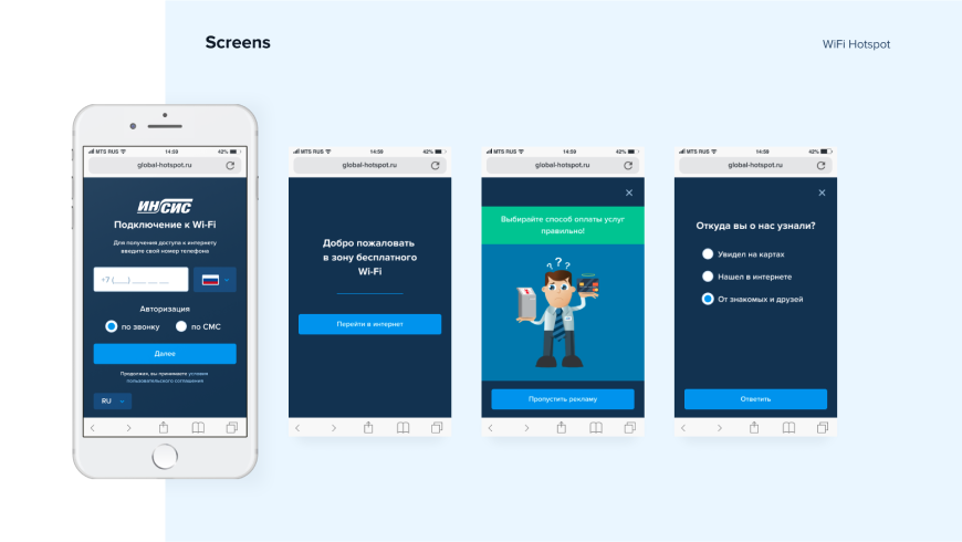
In the process of redesigning the hotspot management service, we added the ability to set up advertising campaigns. WiFi hotspots owners have got the easiest tool to build their login pages. They can add customer surveys and banner ads, change text, background images, and colour palette. It works like a mini landing page builder.
Landing pages
After the release of the new "Cloud CCTV" personal account, we updated the landing page about the service on the Insis website to show the users how everything has changed.
Achieved goals and KPI based on the launch results
The main feedback we received from the client was that the users finally started using it! Previously, many of the features in these services were hidden, inconvenient, hard to notice, but now they are really useful.
Cloud CCTV
In the first 4 months, 1000 Insis customers started using the updated personal account and connected 3000 cameras. The client is satisfied with the outcome and considers the new interface their calling card for promoting the service throughout Russia.
WiFi Hotspot
According to the client, sales of the service grew by about 5% in the short term, even without an advertising campaign. Insis received a large number of positive reviews, including from major customers like Powerhouse Gym, Pizza Mia, etc.
You might also like

