
Logo Development for House of Horani, a Premium Cosmetics Brand
We are excited to share the process of creating the logo for our client House of Horani, a premium cosmetics brand. This is a new brand, and our team is helping with both the logo design and the development of the product website. We absolutely love projects like this – working with an energized team and a fantastic product, where we can apply our design expertise. Today, we'll walk you through the logo development process, from emotions to visuals.
Getting Started
As always, we begin with a briefing. This is a crucial step to understand what we want to convey through the logo, what values the brand represents, and who the target audience is. For House of Horani, the focus is on offering luxury products that everyone can experience, with an emphasis on the beauty found in the details.
Marina and Tareef, the founders, shared with us the key emotions and ideas that needed to be reflected in the logo:
- Spa experience in the shower
- Traditions and old world heritage
- Elegance and refinement
- Premium quality and luxury
- Formulated in France
Grigory Koposov, JetStyle's art director, designer and font developer, was in charge of the logo creation for House of Horani.
Researching Competitors
We began by analyzing the competition. We needed to understand how we would stand out among other brands—both in terms of differentiation and maintaining continuity.

Sketching and Ideas
Our first steps involved exploring an Arabic theme, inspired by the brand's name.
During the first meeting with the client, we clarified their preferences — the logo needed to have an old money aesthetic.
We also considered Art Nouveau and Art Deco styles.
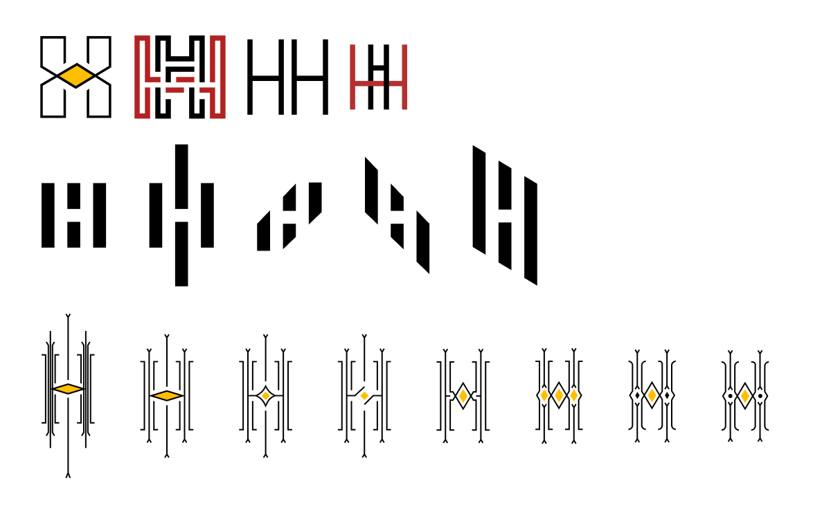
Monograms and Packaging
Monograms are always an interesting choice because they can easily be adapted to various media, including social media.
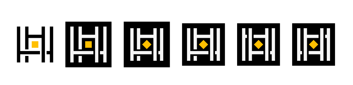

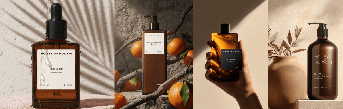
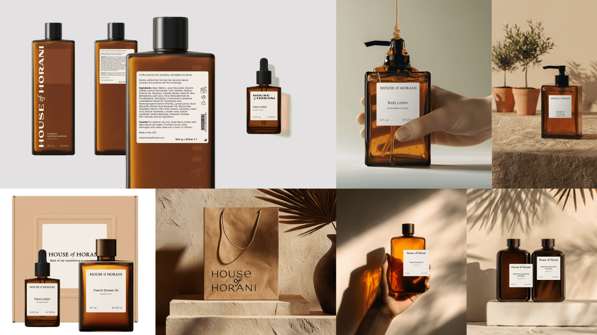
At early stages, we also considered how the logo would look on packaging:
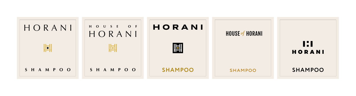
Every visual element evokes specific emotions and associations. It was essential that the logo not only looked good on the label but also reflected the brand's essence.
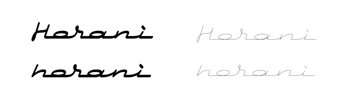
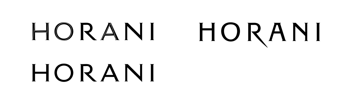
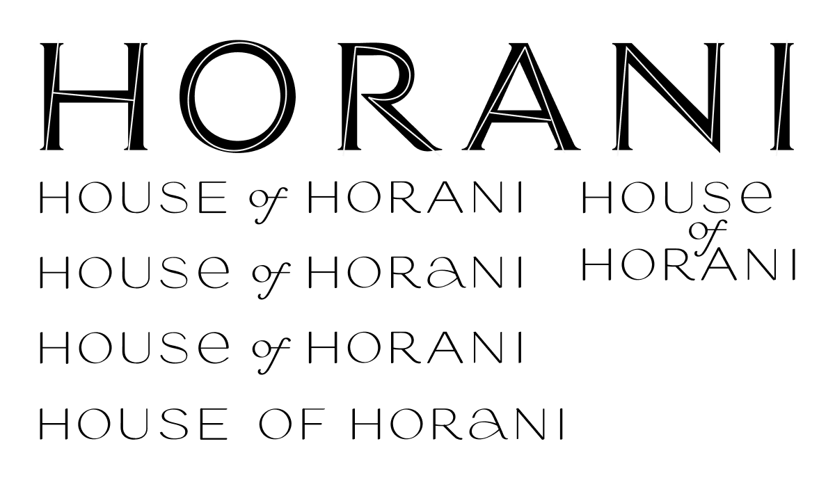
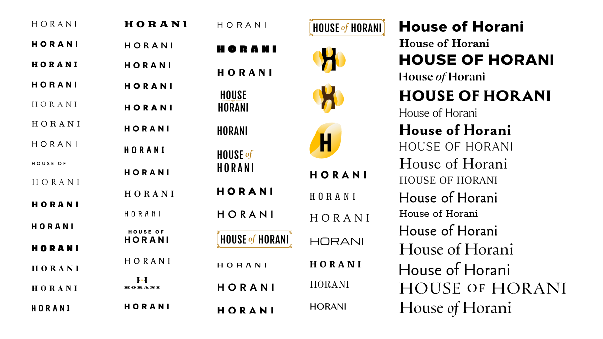
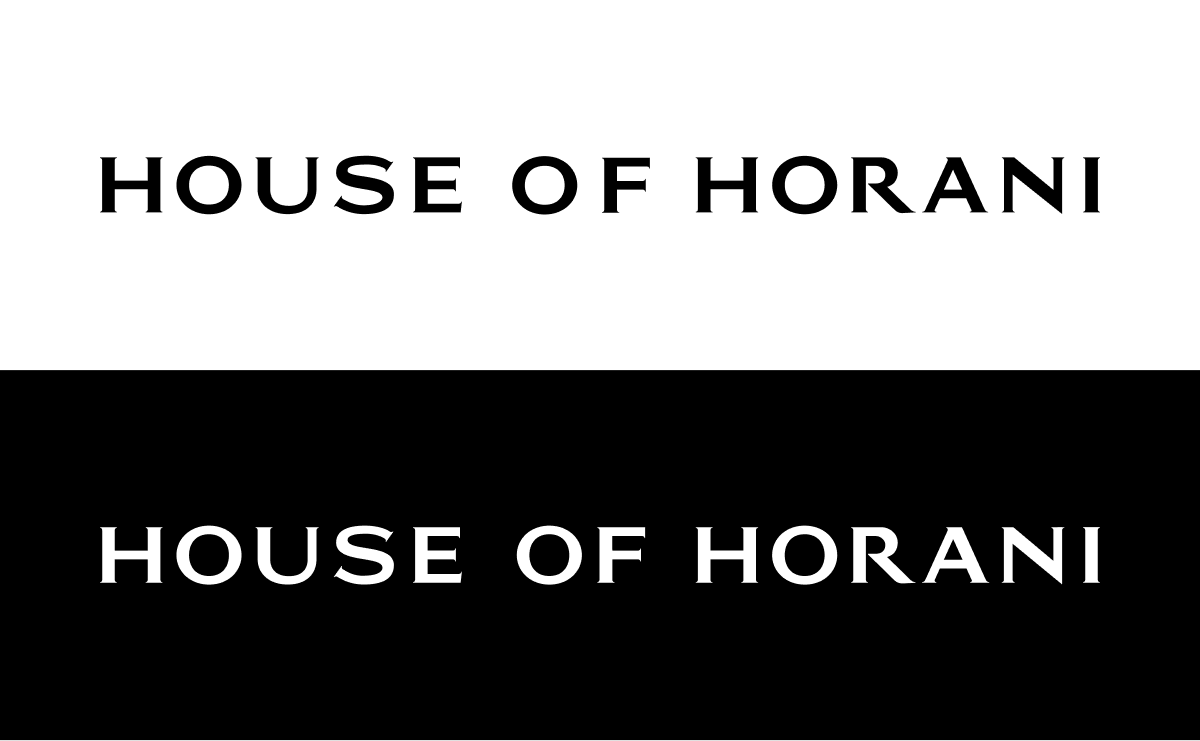
Ultimately, we leaned to a custom font development that turned out to be the best match for the brand's character.
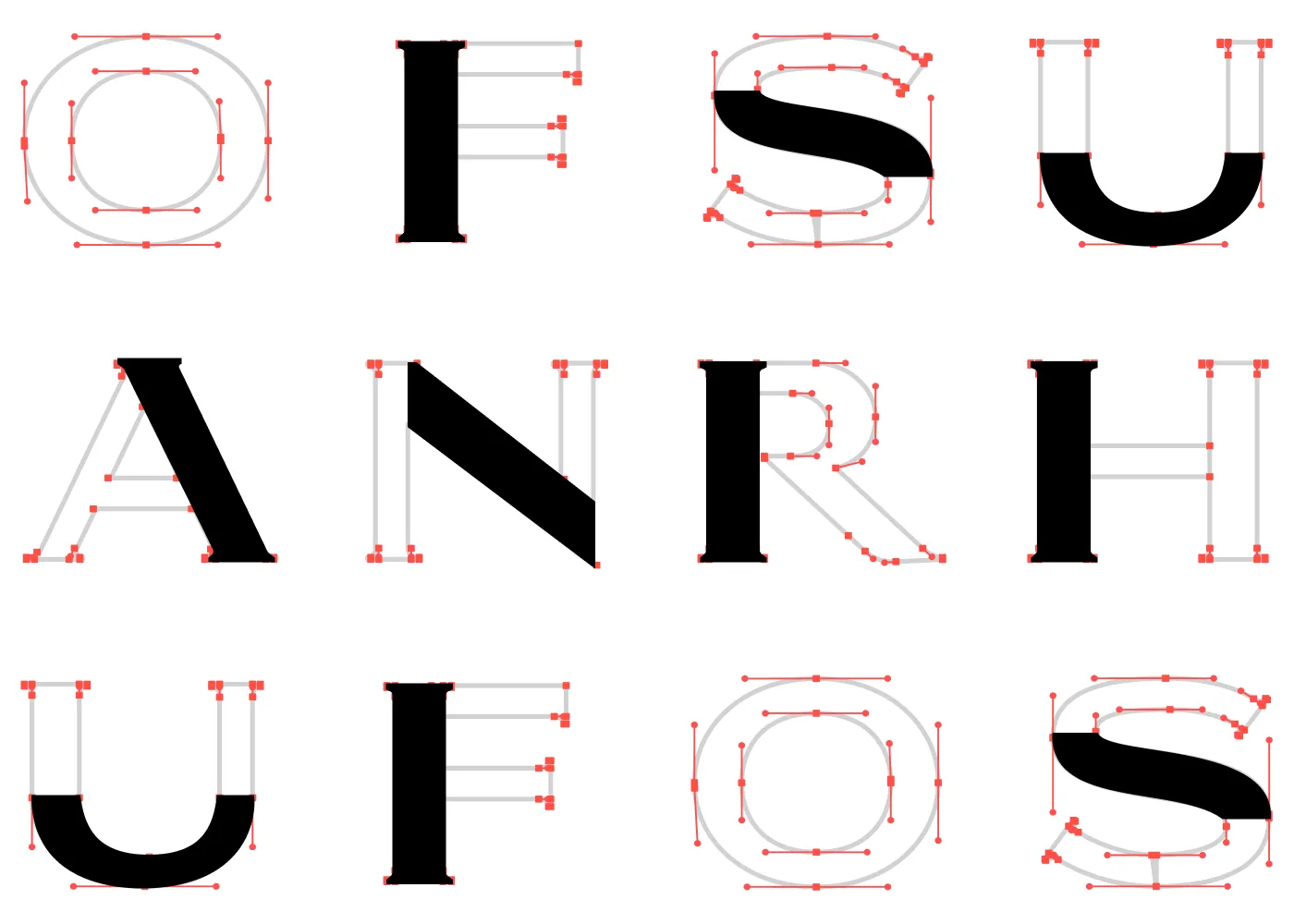
Font Development
Our designer, Grigory, who has over 20 years of lettering experience, drew the font from scratch. Each letter's grapheme was combined with an artistic solution, creating a unique logo that perfectly captured the brand's identity.

Since the brand name is fairly long, we focused on fitting it into a small label format. We looked for a font that would be readable and, at the same time, seamlessly fit into the brand's premium look.
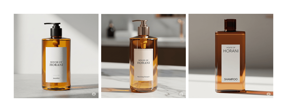
We tested how the logo would fit across the entire product line and tried different positioning ideas:
After reviewing numerous options, we decided on the first hand-drawn lettering style. It was important to review all possibilities together with the client and test various versions to choose the perfect one. This always requires time and collaboration.
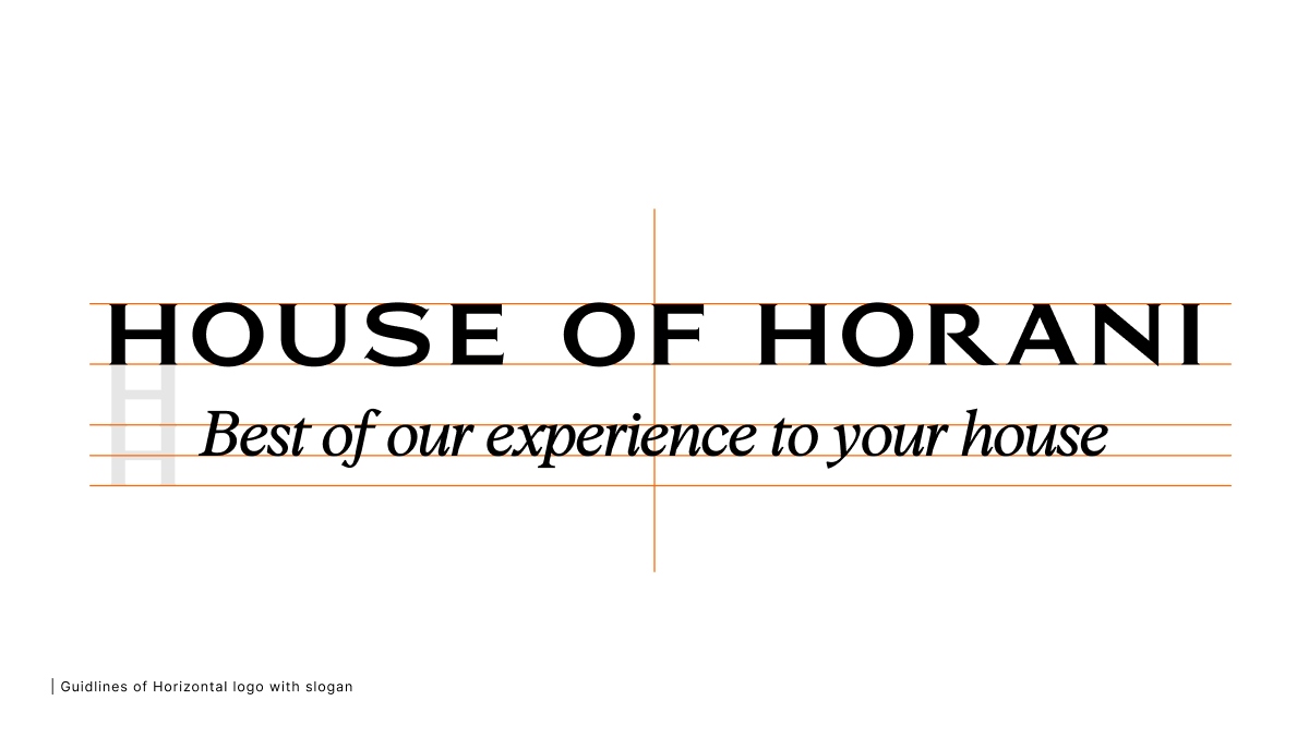
We then worked on the structure of the logo and how it would look with the tagline. This was an important step to ensure the logo would work seamlessly with additional text:

The main work on the logo is now complete, but we continue to provide creative supervision during the next stages.
At this stage, we're not controlling the packaging, but we're always ready to provide creative supervision during the packaging development process, which we'll do with Marina and Tareef. We're also creating a brand book, a document that contains important information on logo usage, its variations, and versions for different media.
We hold weekly meetings to showcase progress and gather feedback, ensuring the brand evolves in a harmonious and effective way.
If you're looking for a visual identity for your brand or product, reach out! We're always excited to work on interesting projects.