
The team came to us with a mission to create a website and logo that would reflect luxury and high-end vibes. At the same time, the brand needed to stay grounded and focused on beauty in the details.
They loved our previous work with 12STOREEZ, especially how visuals aim to pull users in.
We needed to create an experience that would make customers feel like they had to try the products.
At first, we thought a flashy product-filled storefront was what we needed. After brainstorming with co-founders Marina and Tareef, we knew it would be too aggressive. So we went for bigger visuals and better flow.
.webp)
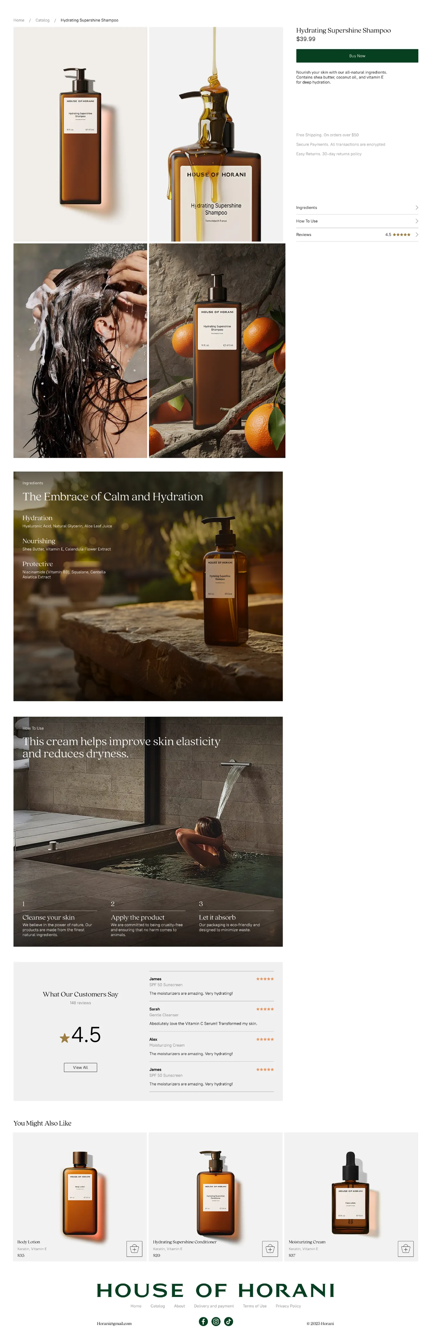
We added an extra layer of interaction to the product cards. On hover, each card reveals a detailed product shot that highlights ingredients, textures, and key benefits. This small UX detail turns a simple catalog into a more engaging experience.
For product pages, we introduced a concept we internally called synesthesia — showing the product through multiple senses at once.Each product is revealed through four types of visuals:
Together, these visuals help users to almost feel the product, even before trying it in real life.
.webp)
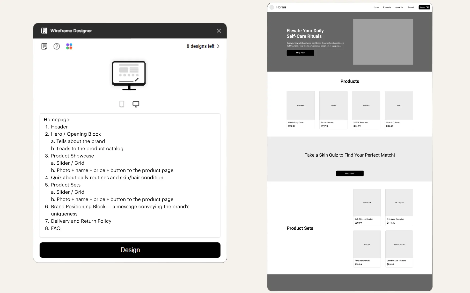
We used AI to speed up the whole process. The AI helped us set up a framework for the site with accurate placeholders for future product photoshoots. That meant we could quickly build out the entire site, filling in the details once the real product images came in.
Fun Fact: At one point, we had a bit of a hassle with AI censorship. When we tried to generate images of women using the products, the AI flagged many of our prompts. But we got creative! Instead of directly asking for "women washing in the shower," we used tricks like "woman next to a bathtub" to work around the system's restrictions. Turns out, a little clever phrasing goes a long way!
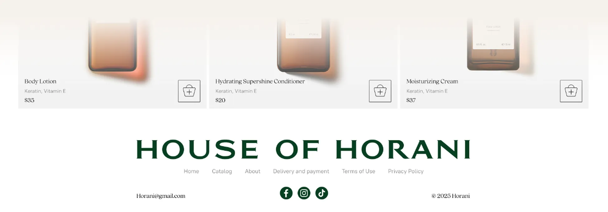
For House of Horani, we decided to make the footer as attention-grabbing as the main page.
In our research, we noticed a trend: footers are becoming a design statement rather than just a space for links. So, we went designed a large, impactful footer that makes a lasting impression.
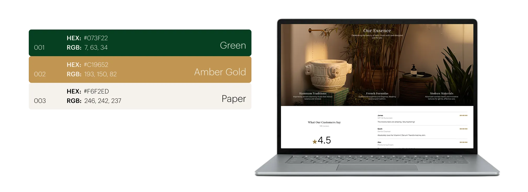
The color palette needed to convey luxury but also feel warm and inviting. Inspired by Mediterranean aesthetics, we selected deep, earthy tones: amber, bronze, and all the cozy, sun-kissed vibes.
Marina and Tareef have been incredible throughout the project: communicative and excited to be involved in every step. Their clear feedback and active participation kept both teams on the same page.

Alex Perminov
the project's designer
It took us just three and a half months to complete the site, from the initial meeting in late July to the final product. Weekly calls helped us keep the project moving forward without costly iterations.