Let’s talk
Logo Development for House of Horani
a Premium Cosmetics Brand
Client

House of Horani, a new premium cosmetics brand focused on elegance, luxury, and beauty in the details.

The team got inspired by our project for the 12 STOREEZ clothes brand and reached out.

Task

To create a premium logo that reflects the brand’s core values of tradition, luxury, and minimalism, while also connecting with the brand's heritage and market positioning.

Challenge
  1. House of Horani needed a logo that embodied its premium identity.

  2. The logo needed to speak to those who value luxury and elegance.

  3. The logo needed to be adaptable across different platforms, from product labels to social media, and fit seamlessly on a variety of packaging formats.

Marina and Tareef, the founders, shared with us the key emotions and ideas that needed to be reflected in the logo:

  1. Spa experience in the shower
  2. Lightness and minimalism
  3. Elegance and refinement
  4. Premium quality and luxury
  5. Formulated in France
Solution

The brand name "Horani" has Iranian roots, and the second co-founder comes from a city known for its amber. These factors could also potentially be sources of inspiration for our designer. Grigory Koposov, JetStyle’s art director, designer and font developer, was in charge of the logo creation for House of Horani.

Researching Competitors

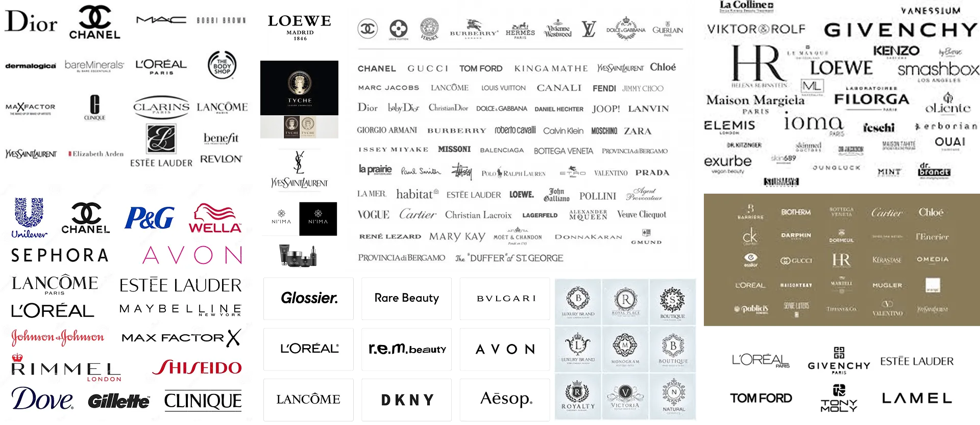
We began by analyzing the competition. We needed to understand how we would stand out among other brands, both in terms of differentiation and maintaining continuity.

Floating ingredients including whole and sliced tomatoes, sliced mushrooms, orange bell pepper, and parsley leaves.
Collage of multiple beauty and fashion brand logos including Dior, Chanel, MAC, L'Oreal, Yves Saint Laurent, Sephora, Lancôme, Givenchy, Estée Lauder, Glossier, Avon, Tom Ford, and more.
Sketching and Ideas

Our first steps involved exploring an Arabic theme, inspired by the brand’s name.

Floating ingredients including whole and sliced tomatoes, sliced mushrooms, orange bell pepper, and parsley leaves.
Four variations of the word 'Horani' in cursive handwriting, each written with different stroke thicknesses.

During the first meeting with the client, we clarified their preferences — the logo needed to have an old money aesthetic.

Floating ingredients including whole and sliced tomatoes, sliced mushrooms, orange bell pepper, and parsley leaves.
The word 'HORANI' displayed three times in different elegant serif fonts with varying artistic styles on a white background.

We also considered Art Nouveau and Art Deco styles.

Floating ingredients including whole and sliced tomatoes, sliced mushrooms, orange bell pepper, and parsley leaves.
Grid of varying stylized 'H' letter logos with geometric elements and yellow diamond shapes.
Monograms and Packaging

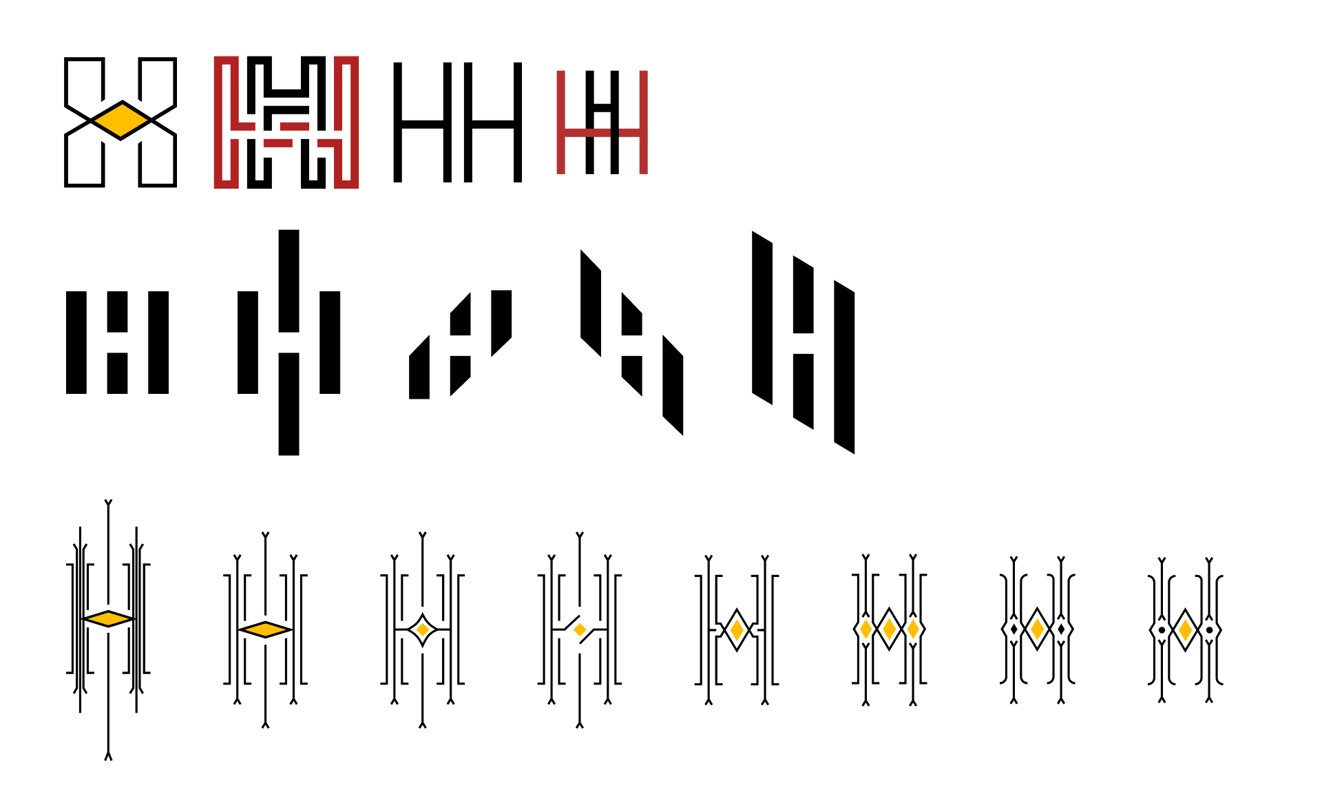
Monograms are always an interesting choice because they can easily be adapted to various media, including social media.

Cheese pizza topped with fresh basil leaves and herbs, with more basil leaves flying above it.
Six stylized black and white square patterns with central yellow shapes, progressively darkening background from left to right.
Collage of four Twitter profile cards and smartphone screens showcasing different Horani app icon designs and their respective brand display on the phone.

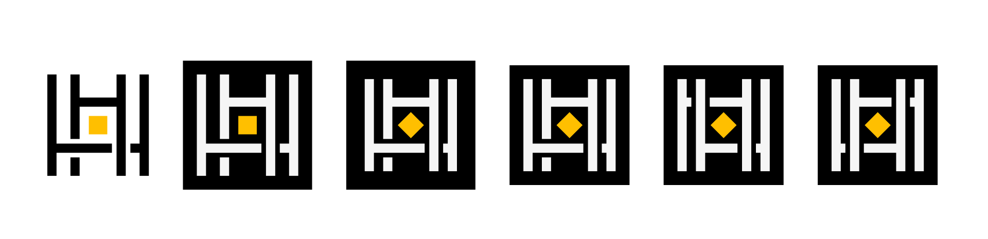
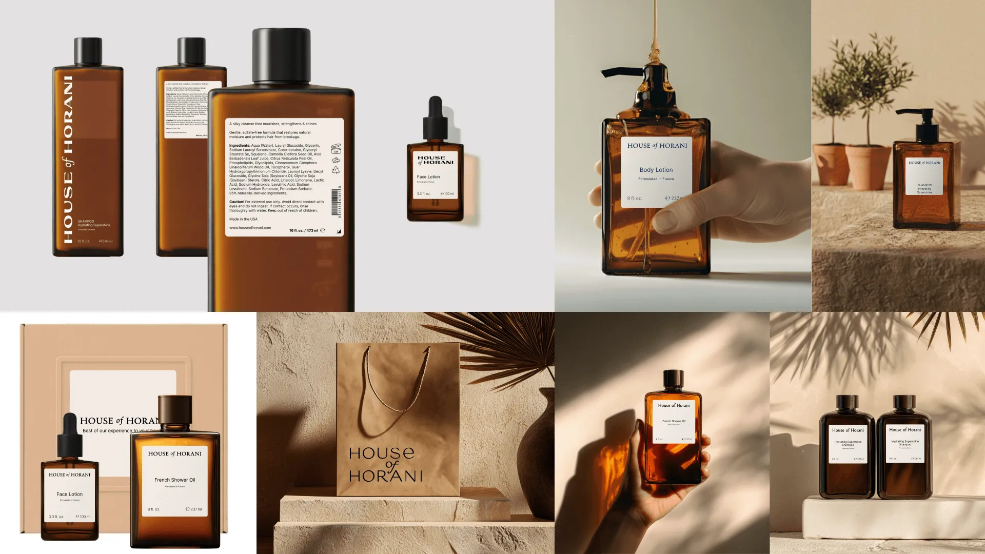
At early stages, we also considered how the logo would look on packaging:

Five square labels with variations of the brand name Horani and the word shampoo, each containing different logo designs with black and gold elements on a beige background.

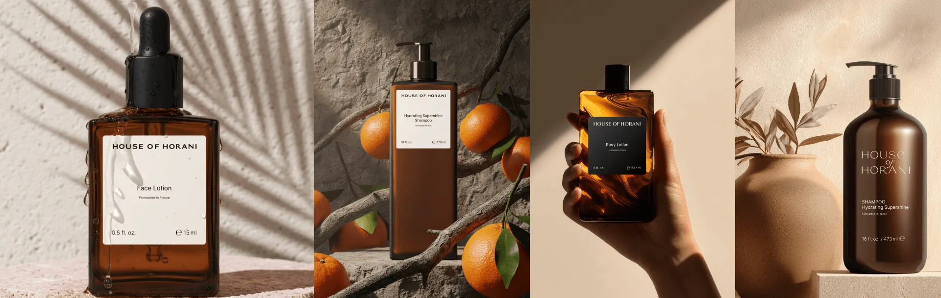
Every visual element evokes specific emotions and associations. It was essential that the logo not only looked good on the label but also reflected the brand’s essence.

Three amber shampoo bottles with different pump styles labeled House of Horani displayed on light and marble surfaces.

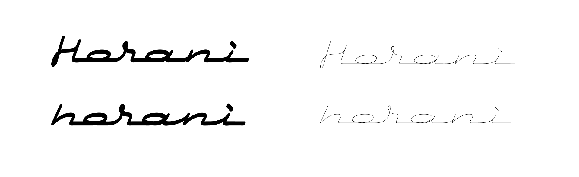
Ultimately, we leaned to a custom font development that turned out to be the best match for the brand’s character.

Font Development

Our designer, Grigory, who has over 20 years of lettering experience, drew the font from scratch. Each letter's grapheme was combined with an artistic solution, creating a unique logo that perfectly captured the brand’s identity.

Stylized text logo with 'HORANI' in large decorative serif letters and 'HOUSE OF HORANI' below in outlined serif font.
Typography samples showing the word HORANI in large decorative font and various styles of the phrase 'HOUSE of HORANI' in thinner, elegant fonts.

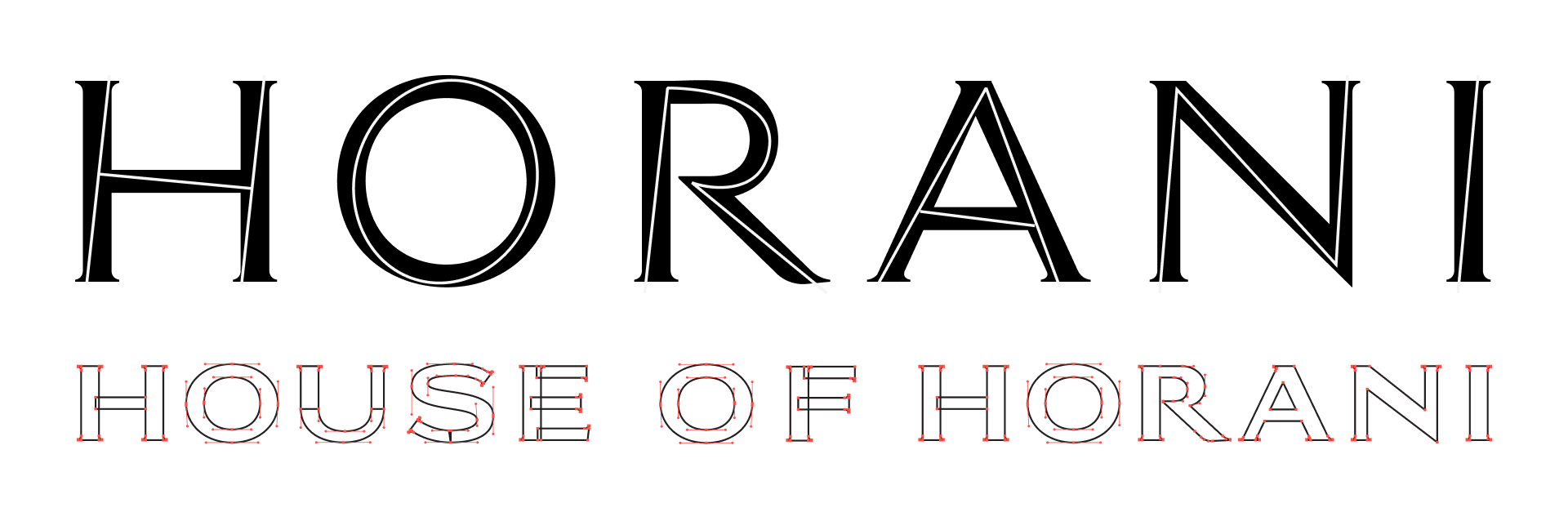
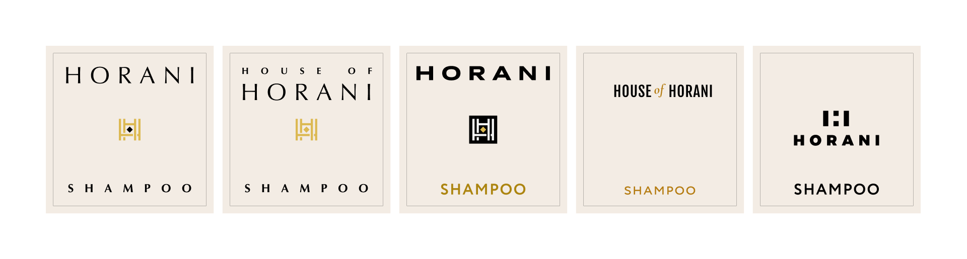
Since the brand name is fairly long, we focused on fitting it into a small label format. We looked for a font that would be readable and, at the same time, seamlessly fit into the brand's premium look.

Various font styles and logo designs displaying the words 'Horani' and 'House of Horani' arranged in five columns with different typographic variations and decorative elements.

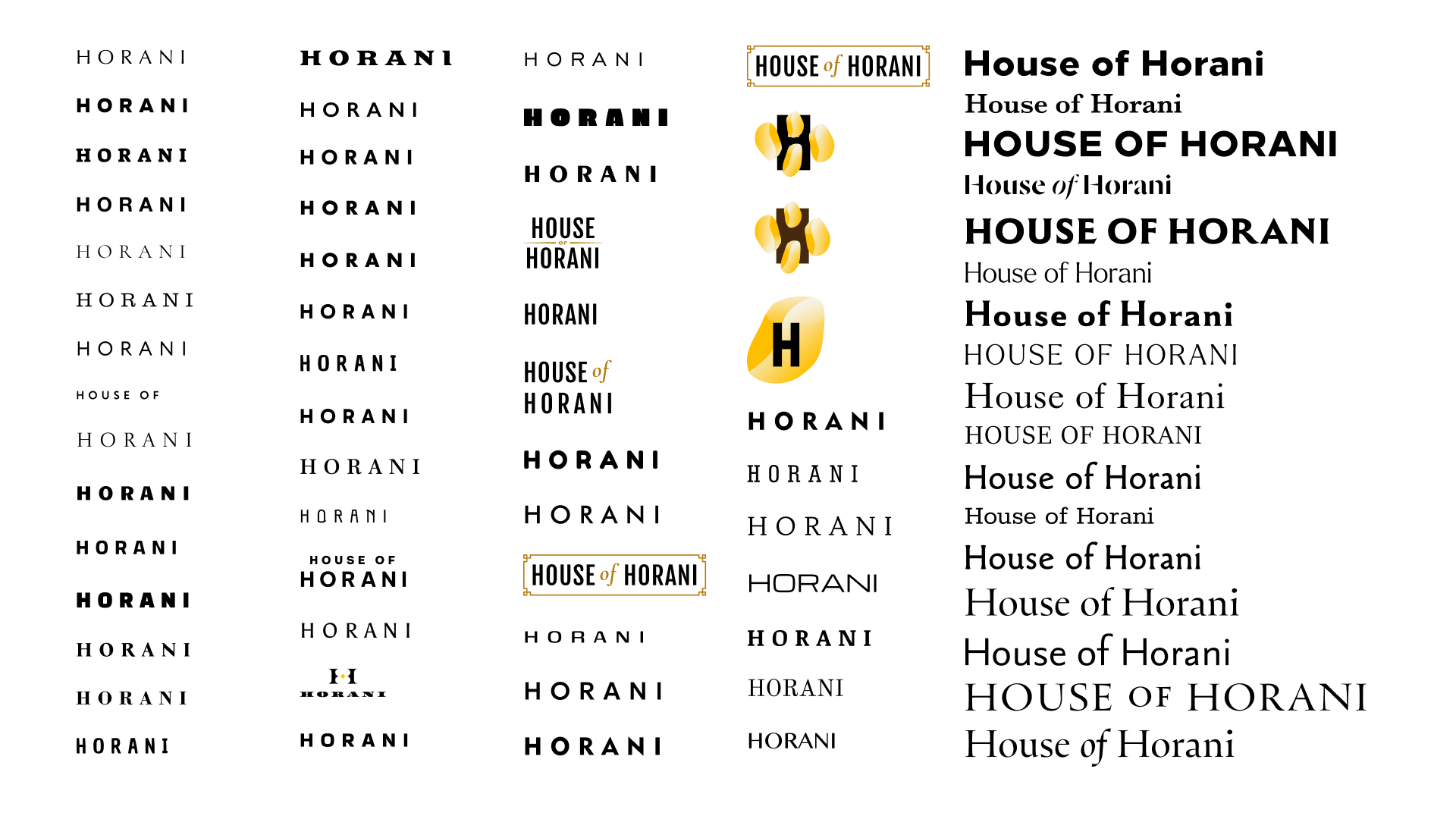
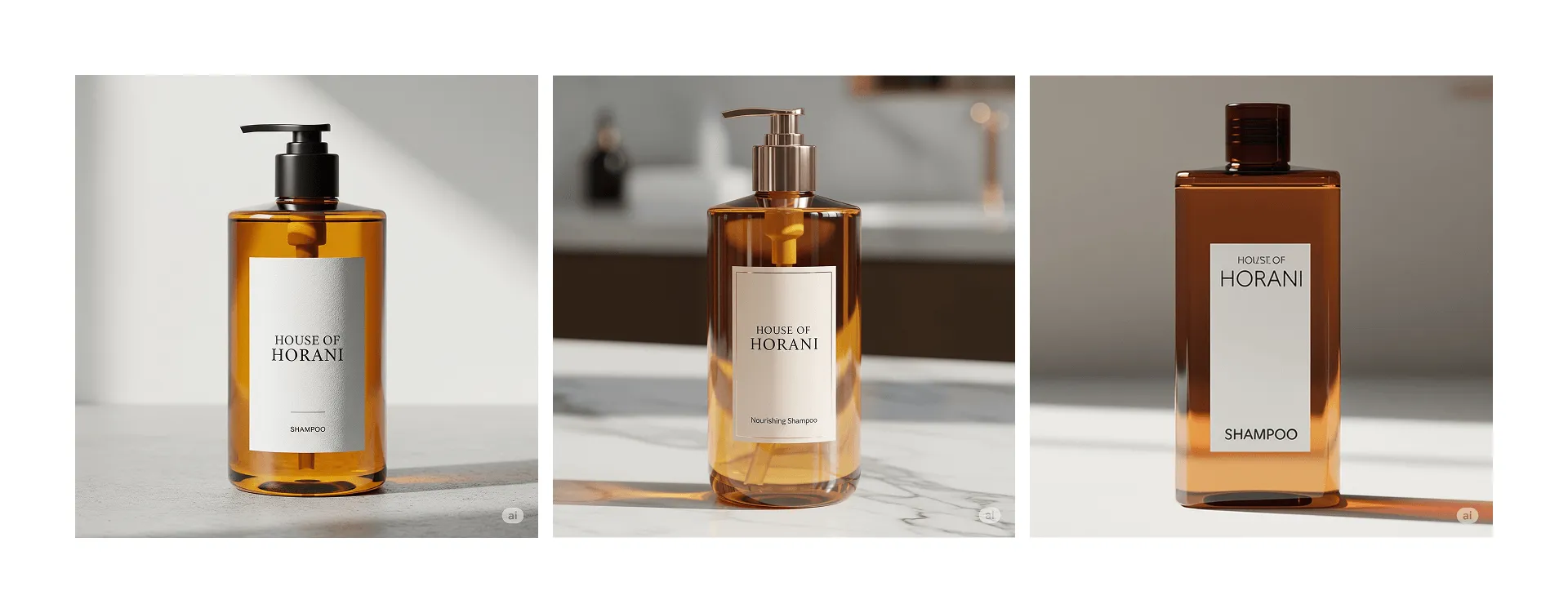
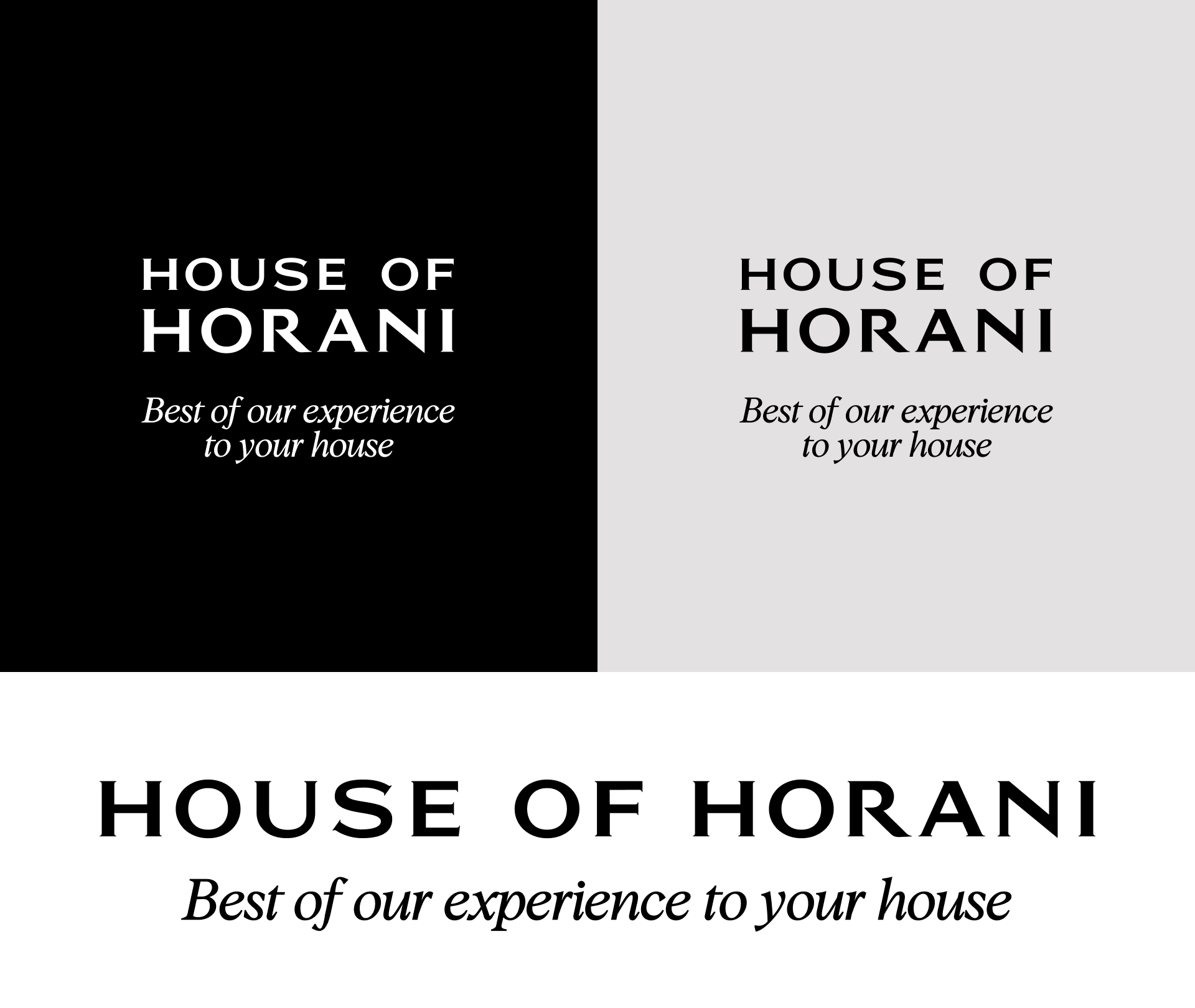
We tested how the logo would fit across the entire product line and tried different positioning ideas:

Four amber brown bottles of House of Horani skincare and haircare products including face lotion with dropper, hydrating supershine shampoo with pump, and body lotion, styled with oranges and natural light shadows.
Collage of amber glass skincare bottles from House of Horani including shampoo, face lotion, body lotion, and French shower oil, with natural light and earthy backgrounds.

After reviewing numerous options, we decided on the first hand-drawn lettering style. It was important to review all possibilities together with the client and test various versions to choose the perfect one. This always requires time and collaboration.

The phrase 'HOUSE OF HORANI' displayed twice, in black text on a white background and in white text on a black background.

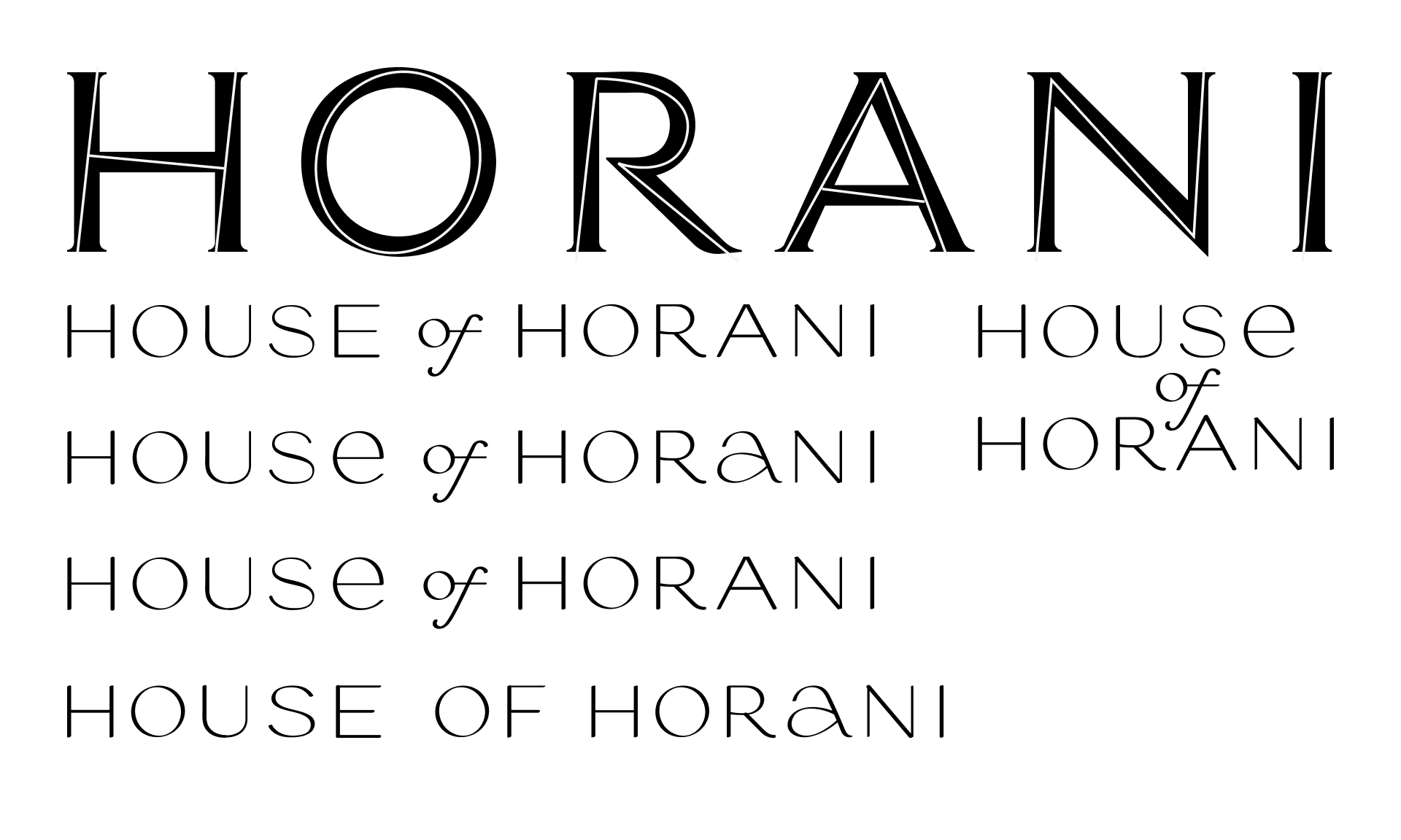
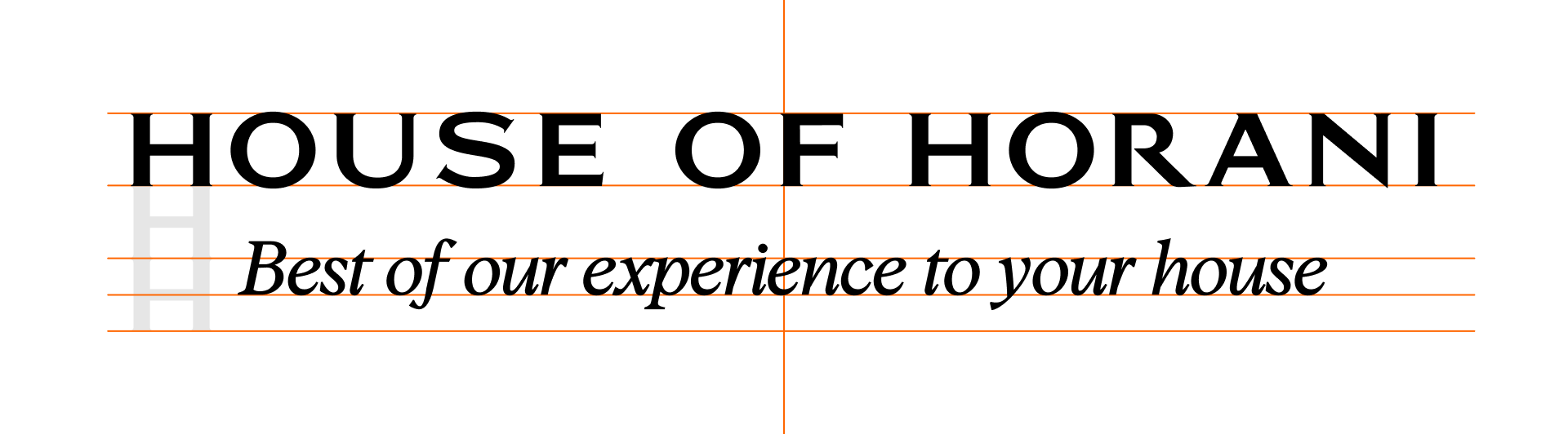
We then worked on the structure of the logo and how it would look with the tagline. This was an important step to ensure the logo would work seamlessly with additional text:

Text reading 'HOUSE OF HORANI' in bold uppercase letters with the tagline 'Best of our experience to your house' in italic below.
Three variations of the text 'HOUSE OF HORANI' with the tagline 'Best of our experience to your house' shown in different background colors: black, light gray, and white.
Collaboration

The process was collaborative, with weekly check-ins to ensure that the logo maintained its integrity across all formats.

The main work on the logo is now complete, but we continue to provide creative supervision during the next stages.

Floating ingredients including whole and sliced tomatoes, sliced mushrooms, orange bell pepper, and parsley leaves.

Marina Horani

Co-founder & Creative Director

We came to JetStyle with a pretty emotional idea — we wanted a logo that would feel luxurious, rooted in tradition, but also light and modern. The team instantly got what we meant. They helped us turn all those abstract feelings into something elegant and alive.

We especially loved the process — weekly calls, clear updates, no stress. It always felt like we were building the brand together, not just approving someone else’s work.

Black letter U with visible red vector editing points and handles on a transparent background.
Let’s Create Your Brand Identity

If you’re looking for a logo that captures the essence of your brand and sets you apart from the competition, reach out to us.

Floating ingredients including whole and sliced tomatoes, sliced mushrooms, orange bell pepper, and parsley leaves.
Let's talk
Alexander,
Project Manager,
will shape the project scope
Let’s talk about your business goals

Leave your contact info,
and we'll get in touch shortly

Name:
Email:
Phone:
By clicking the submit button you agree to our Privacy Statement
Sent!
We’ll get back to you soon
Oops! Something went wrong while submitting the form.